There's a piece of Dalia Varanka's paper on the rise of the "Plain Style" in mapping around 1700 that has been gnawing at me. I referred to it in my recent essay on cartography and aesthetics in Cartographic Perspectives, but I think it deserves some deeper pulling-out.
[FYI, Varanka's paper is not available online: it's “The manly map: the English construction of gender in early
modern cartography.” in Gender and Landscape: Renegotiating the Moral Landscape, edited by J. Carubia, L. Dowler, and B. Szczygiel. New York/London: Routledge.]
The piece that's bugging me is this: why is decoration trivial? I take it as a given, something that doesn't need further explanation: form follows function, and decoration is an add-on. Flourishes, trills, scrollwork and so on, are less "honest," in this view, than plain, unadorned, prose. Manly prose—you know, like Hemingway.
See what I mean? This thread of appearance being false, of truth being deep, runs to the bone in our culture. And it isn't true everywhere: saving "face" is seen crucial in many cultures. Even in our culture, there is a long and deep divide which has not been entirely settled, between those who think God cares about what we do and those who think what we are is essential: in Christian terms, works and faith.
Outwardness and inwardness were a part of my formative pop-psych thinking: I remember M&M's being a popular metaphor in high school: the hard exterior and the soft, delicate inside. The astrological notions of sun-sign (true inner self) and ascendant (what you feel the need to appear like) also made an appearance.
That latter, though I do not believe in the functional idea (that when you were born determines who you are) does I think provide a way to think of decoration as essential. Because it says that how you want (or even need) to be seen is itself an essential part of who you are. It's not a "fake" thing you can change at will. Some seemings will fit you better than others, just as your true inner self is what it is.
Adolph Loos' Ornament and Crime posited that ornament was a waste of time, because fashion changes. And we have come to see outward presentation as synonymous with fashion. Being changeable, fashion is not trusted. We want our truths to remain on a single, unwavering course. That's what faith is: sticking with your allegiance to a person or an idea no matter what. Even if, as with Mother Teresa, you never actually achieve that numinous moment, you still get counted as saintly if you stick with a strict goodness.
But some ornament is not especially prone to fashion. Traditions include ornament, whether it be in religious decoration, folk dances and music, or traditional costume. Even when radical technological change steps in (as with aniline dyes and many fiber traditions), there is seen to be a deep well of sameness and conformity that is valued, even as it is all about "unnecessary" patterning on functional objects.
So why is ornament important? I think of patterns of tile, or of geometric grillwork, that I see when passing time. I especially notice it in bathrooms. These provide a place for the mind to work and rest simultaneously. A field of play, perhaps. They are certainly better for the mind than an utterly blank slate (or tile). We like to play off of patterns. I do anyway. And so decoration, on surfaces and tools we use every day, give us something to work with.
It's the idea of play that I think is the stickler here. The arguments against ornament are mostly serious. Ornament is seen as silly, a distraction perhaps. And I suppose in places where total concentration is necessary, it is. The question is, should our lives be spent in that kind of concentration? I don't think that's very healthy-sounding. We need to build in play, just to keep ourselves sane. Our lives can't be built so thoroughly on importance and concentration; there's a reason U.S. Presidents seem to age so quickly.
Decoration, then, keeps us young. Perhaps. Or at least keeps us from getting too old, too fast.
What I see as a deeper problem, then, is not that we need decoration, but that we need to build our lives where decoration and underlying form come together inseparably. Again, the astrological model is one I hold up: that the healthiest approach to decoration is that form and function are in fact one, that the object and the patterns we see in it are the same, not a core and an add-on. That the M&M is one candy, not two parts adhered together.
And this doesn't mean (in maps for example) that every pixel must carry inward meaning. Some marks do not mean anything about the core structure of a place. Sometimes, they are texture. But that texture is part of what the place is about. That paisley print is not coded with instructions; it's an abstract design. But that design, if it fits, becomes part of what you are when you are wearing it. And that texture, that added noise, as it were, even though it is not consciously spoken by you or even understood by you, is part of what you are.
I think this is the root of our modernist discomfort with decoration: we want to be in control. Just like the English Empiricists who promulgated the Plain Style, we want to exercise our conscious power over as much as we can, and to eliminate that which we do not consciously control. This obsession with maintaining an order we can understand is arrogant in the extreme. And in the end it will kill what we love, which is not entirely under our command. That decoration, that patterning we make, turns out to be an imitation of the vast, intricate, impossible to entirely comprehend web of processes that keeps us and this world alive.
Showing posts with label pictures. Show all posts
Showing posts with label pictures. Show all posts
Saturday, August 24, 2013


Tuesday, June 16, 2009
Pretty Maps
I've felt out of the loop for a few months, busy with other stuff. There was a thread recently in Carto-Talk about GIS folks and "pretty maps" that got me going. My response was:
It's the phrase "making the map pretty" that gets me. I don't make pretty maps. It's like saying that the fine arts are about pretty pictures.
The world of modern cartography isn't about pretty, though sometimes that is a pleasant side-effect. It's about clarity and effectiveness as a visualization tool. But the same things that make a picture pleasant to look at (pretty), are core parts of effective, clear communication: awareness of emphasis, harmony and contrast of color sets, attention paid to the framed shapes and to an overall sense of visual balance. What makes a good piece of modern cartography work is that attention to these things is not in the service of "pretty"—a vacuous word—but in the service of meaning and understanding.
I'm going to recommend an obscure book that really helped me parse this out, by one of my favorite illustrators, Molly Bang. It's called Picture This, and I really enjoyed it.
I think what people who talk about pretty maps don't get is that visual harmony is not the same as pimping your ride. I came to cartography from graphic design 19 years ago because I didn't want to do any more ride-pimping. There's a distrust of design in some quarters because it is, in the wider world, often used to deceive and entice; it's an advertising and marketing field in large part.
And so, I think, some people resist the idea of cartographic design because it sounds like covering up the data with some rhinestones and lipstick. They believe that a map that is "plain" and unadorned, is one which is most honest.
But what I think most folks don't realize is that "plain" is not the same as "lazy." Plain is just as much of a carefully crafted visual statement. I certainly have made that mistake in my personal life: I'm a lazy dresser, and I think I sometimes excuse myself by painting myself as "plain." The Amish put a fair amount of effort in preserving their sober dress: cleaning, ironing, etc. That's different from slapping on a pair of jeans and a t-shirt.
"Pretty" is a straw-man used by those who want to get out of making a map work visually, by equating attention to visual flow and structure with propagandistic manipulation. Good "plain" design is just as much work, and requires just as much attention to design as an effectively pimped-up map will.
Tuesday, March 24, 2009
John Bachmann
I've mentioned John Bachmann before, but I should note my new article, in the current issue of Imprint. It's been a pet project of mine since 1999 (here's an older version of the paper I did for the New England American Studies Association, from 2001), and it's gratifying to see it looking so nice. Here's a summary:
Anyway, it's nice to finally see this bit of work done...
John Bachmann was born in Switzerland around 1814 and died in Jersey City, New Jersey around 1894. John Reps writes "No finer artist of city views worked in America," and indeed Bachmann's bird's eye views are unique in the history of American views for their combination of artistic technique inherited from European landscape drawing, in which he was trained and worked in Paris, and the experimental sensibility he had in constructing his views from viewpoints he had never seen. His career saw the transition from one-color stone lithography through multiple-tint-stone techniques into zinc chromolithography, and from printed views as decoration and commemration to views as promotional and speculative documents. His views reflect not only the changing landscape of New York City and the other cities he drew, but the changing landscape of the American print world.If you want to see more of his work, a good start is the Library of Congress collection, which is split between the Geography and Maps Division (bird's eye city views and Civil War panoramic maps) and the Prints and Photographs Division. Other significant collections on-line include the New York Public Library. Non-online collections with significant holdings include the New-York Historical Society, the Bibliotheque Nationale in Paris, the Historic New Orleans Collection, and the Museum of the City of New York.
Anyway, it's nice to finally see this bit of work done...
Tuesday, March 10, 2009
Revisiting Tufte, Pt 2: In Defense of the Ridiculous
First off, please don't get me wrong. The man's a genius. Ed Tufte's books really are glorious explications of unspoken rules and structures in a world (information graphics) that's supposed to be all about clarity but is surprisingly opaque even to its experienced practitioners.
They're also a treasure trove of examples of information graphics and how to make them clearer.
I've been realizing as I revisit Tufte that his foundational structure is pretty well laid out in The Visual Display of Quantitative Information, the first of his "picture books". The other three books are essentially collections of add-on essays. There may be themes running through the books, but really each chapter stands alone quite well, referring to the original book and to other essays from all four volumes.
I was struck by a few other things:
1. data and texture
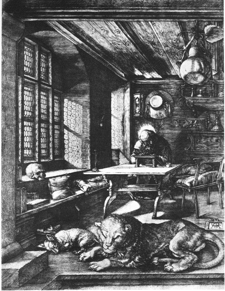
In Beautiful Evidence, in the chapter on "sparklines", he evokes the intensity of linework in older western artists, using a sample from a Dürer engraving. He evokes it, but I think he mis-describes it. In Tufte's vision, all marks are information—all ink is data. Tufte evokes the Renaissance artist and then moves on to Swiss mountain cartgoraphy, with its similarly intense linework, implying that the Swiss are in the same business.
It's revealing that Tufte chose Dürer to evoke instead of, for example, Rembrandt. Dürer, to our eyes, is fussy; the intensely engraved lines at once read as texture and as information: every mark has a feeling of intent, and the sum is a rich picture, full of recognizeable detail but still forming a coherent statement as a whole.
Rembrandt's etchings are no less detailed, and form no less of a statement, but each mark does not imply data in the same way Dürer can seem to. Rembrandt's marks, especially as he matured, are about texture. In the map world, we know that's a lot of what pulls a map together: texture. We want it to be meaningful, for that texture to itself carry meaning, but we need to remember that the holding-together of the map is what it's really there for, and that at a certain level it no longer carries specific data-meaning: at one scale the wobbles of a river-line are traced precisely, but at a certain point they only mean "the river isn't straight." They are texture, not data.
2. ridicule
I was struck at how Tufte uses ridicule as a weapon against the "enemy": Clarity is good, confusion is bad. If you're going to intentionally create a muddle, make it a clear muddle. And he picks good targets: the ineffective decision-making that led to the Challenger explosion, Powerpoint's limitations...
Here's the problem:
If we become afraid of ridicule, we will not push ourselves. Sometimes, like when launching a hugely expensive piece of equipment into outer space with seven humans aboard, careful is a really really good idea. But not all charts and statistics should carry this sort of load. That no-fun attitude is, maybe, why cartography ends up feeling so stilted sometimes.
I'm a believer in Sturgeon's Law, “Ninety percent of everything is crap.” Theodore Sturgeon was a science fiction writer. From Wikipedia:
What baby? What bathwater?
3. In defense of texture and the Baroque
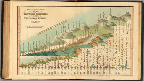
Tufte points to a graphic like this first in Envisioning Information as an example of an interesting use of simplification and distortion to allow comparison. Later, in Beautiful Evidence, he ridicules it for having all that extra texture, the knobby lakes and so forth. To me, this is a really beautiful and interesting graphic, something to strive for, not an eccentric maiden aunt. That texture and those extra squiggles don't communicate Really Useful Data, but they do present part of a sense of identity and character.
Tufte attacks information graphics with unnecessary framing, or with editorial illustration, and he uses egregious examples to do it with. But like Sturgeon says, there's lots of crap to go around. I want to look at some baroque graphics that work. Like the river-comparison chart, or historic illustrated maps. Tufte repeatedly quotes Jonathan Swift: "So, geographers in Afric maps,/With savage pictures fill their gaps/And o'er unhabitable downs/Place elephants for want of towns.").
You know, I like the elephants. I like illustrated maps when they are done well. There are lots of badly done "plain" maps, and Tufte is at his best when he's giving us a theoretical framework to work within in building that sort of graphic, but I think he falls down when he turns around and says that that sort of graphic is superior to baroque graphics.
Over and out for now.
They're also a treasure trove of examples of information graphics and how to make them clearer.
I've been realizing as I revisit Tufte that his foundational structure is pretty well laid out in The Visual Display of Quantitative Information, the first of his "picture books". The other three books are essentially collections of add-on essays. There may be themes running through the books, but really each chapter stands alone quite well, referring to the original book and to other essays from all four volumes.
I was struck by a few other things:
1. data and texture
In Beautiful Evidence, in the chapter on "sparklines", he evokes the intensity of linework in older western artists, using a sample from a Dürer engraving. He evokes it, but I think he mis-describes it. In Tufte's vision, all marks are information—all ink is data. Tufte evokes the Renaissance artist and then moves on to Swiss mountain cartgoraphy, with its similarly intense linework, implying that the Swiss are in the same business.
It's revealing that Tufte chose Dürer to evoke instead of, for example, Rembrandt. Dürer, to our eyes, is fussy; the intensely engraved lines at once read as texture and as information: every mark has a feeling of intent, and the sum is a rich picture, full of recognizeable detail but still forming a coherent statement as a whole.
Rembrandt's etchings are no less detailed, and form no less of a statement, but each mark does not imply data in the same way Dürer can seem to. Rembrandt's marks, especially as he matured, are about texture. In the map world, we know that's a lot of what pulls a map together: texture. We want it to be meaningful, for that texture to itself carry meaning, but we need to remember that the holding-together of the map is what it's really there for, and that at a certain level it no longer carries specific data-meaning: at one scale the wobbles of a river-line are traced precisely, but at a certain point they only mean "the river isn't straight." They are texture, not data.
2. ridicule
I was struck at how Tufte uses ridicule as a weapon against the "enemy": Clarity is good, confusion is bad. If you're going to intentionally create a muddle, make it a clear muddle. And he picks good targets: the ineffective decision-making that led to the Challenger explosion, Powerpoint's limitations...
Here's the problem:
If we become afraid of ridicule, we will not push ourselves. Sometimes, like when launching a hugely expensive piece of equipment into outer space with seven humans aboard, careful is a really really good idea. But not all charts and statistics should carry this sort of load. That no-fun attitude is, maybe, why cartography ends up feeling so stilted sometimes.
I'm a believer in Sturgeon's Law, “Ninety percent of everything is crap.” Theodore Sturgeon was a science fiction writer. From Wikipedia:
The meaning of Sturgeon’s Law was explicitly detailed by Sturgeon himself. He made his original remarks in direct response to attacks against science fiction that used “the worst examples of the field for ammunition”. Using the same standards that categorize 90% of science fiction as trash, crud, or crap, it can be argued that 90% of film, literature, consumer goods, etc. are crap. In other words, the claim (or fact) that 90% of science fiction is crud is ultimately uninformative, because science fiction conforms to the same trends of quality as all other artforms do.From my point of view, Tufte in using ridicule to fight against what he calls "chartjunk" is also throwing out the baby with the bathwater.
What baby? What bathwater?
3. In defense of texture and the Baroque
Tufte points to a graphic like this first in Envisioning Information as an example of an interesting use of simplification and distortion to allow comparison. Later, in Beautiful Evidence, he ridicules it for having all that extra texture, the knobby lakes and so forth. To me, this is a really beautiful and interesting graphic, something to strive for, not an eccentric maiden aunt. That texture and those extra squiggles don't communicate Really Useful Data, but they do present part of a sense of identity and character.
Tufte attacks information graphics with unnecessary framing, or with editorial illustration, and he uses egregious examples to do it with. But like Sturgeon says, there's lots of crap to go around. I want to look at some baroque graphics that work. Like the river-comparison chart, or historic illustrated maps. Tufte repeatedly quotes Jonathan Swift: "So, geographers in Afric maps,/With savage pictures fill their gaps/And o'er unhabitable downs/Place elephants for want of towns.").
You know, I like the elephants. I like illustrated maps when they are done well. There are lots of badly done "plain" maps, and Tufte is at his best when he's giving us a theoretical framework to work within in building that sort of graphic, but I think he falls down when he turns around and says that that sort of graphic is superior to baroque graphics.
Over and out for now.
Saturday, February 14, 2009
Revisiting Tufte, Pt 1: Visual Display of Quantitative Information
[note: I have this to say about pneumonia: Bleh! I'm feeling much better, but let me just say that as weight-loss programs go, I do not recommend this one]
In response to Katie Benjamin's question, I decided to go back and read Edward Tufte. I read him years ago, but it's been years.
I've started with the first of his "big books," The Visual Display of Quantitative Information.
A few thoughts:
The book starts out so well. Really good observations and history of statistical graphics. And then the basic concept of graphical integrity, one in a lineage of "graphic parades of horribles," in a line with How to Lie With Statistics and How to Lie With Maps. It's an effective and entertaining technique, and Tufte does a good job with it, in particular excoriating those who make infographics that in their pictoriality distort the data.
In particular, the idea of the ink-to-data ratio is a useful one: if a mark doesn't mean something, leave it out. It's really a Strunk-and-White kind of practical model towards lean and effective graphics.
After that, I fear things go downhill. First, his analysis of why we have bad statistical graphics. He ascribes this to (1) bad training on the part of graphic folk who haven't spent much time with data analysis: they are drawing about things they know little about; (2) the idea that statistics are boring and need "livening up" if readers are going to pay attention; and (3) the idea that readers won't understand charts if they're too plain.
Basically we have charts that lie because the people who make graphs are ignorant, disrespectful and bored. If you make bad graphics, it's a character fault. I think it's a cheap shot.
He then goes down the road towards graphic language reform in the name of "data-ink" maximization, proposing specific new techniques that feel to me a little like the spelling reforms of Melvil (aka Melville) Dewey: based on sound theory, but ignoring the power and centrality of cultural habit. They assume because something makes sense and fits an ideal of simplicity that people will either do that something or be dunderheads.
Maybe people like complexity for its own sake. Sometimes at least. Coming soon, a blog entry: in defense of the graphically baroque.
The following chapter I think illuminates what's really going on: It's called "Multifunctioning Graphic Elements" and it's about graphics that can be read fully from a variety of different view points. The graphics in this chapter are like poems: they are multi-faceted, complex, sometimes ambiguous in the sense that they play different sorts of information off each other in the same expression.
They really are things of beauty.
So here's what I think: sometimes you want a poem, but sometimes you you want a straight answer to the question, "how much does that tomato cost?"
The former, you want to pack in multiple layers of meaning in a way that may miraculously land in your lap or that may take years of gathering and pondering. The latter, you want a clear social mind operating in the moment, which can respond in the same language to a conversational question.
The presumtion that all communications ought to strive for a single ideal oversimplifies the variety of human communication. I think Tufte actually has interesting reads on multiple pulses; I'm just not convinced that in his quest for Overarching Rules he hasn't Overreached.
In any case, more from the Tufte trail soon...
In response to Katie Benjamin's question, I decided to go back and read Edward Tufte. I read him years ago, but it's been years.
I've started with the first of his "big books," The Visual Display of Quantitative Information.
A few thoughts:
The book starts out so well. Really good observations and history of statistical graphics. And then the basic concept of graphical integrity, one in a lineage of "graphic parades of horribles," in a line with How to Lie With Statistics and How to Lie With Maps. It's an effective and entertaining technique, and Tufte does a good job with it, in particular excoriating those who make infographics that in their pictoriality distort the data.
In particular, the idea of the ink-to-data ratio is a useful one: if a mark doesn't mean something, leave it out. It's really a Strunk-and-White kind of practical model towards lean and effective graphics.
After that, I fear things go downhill. First, his analysis of why we have bad statistical graphics. He ascribes this to (1) bad training on the part of graphic folk who haven't spent much time with data analysis: they are drawing about things they know little about; (2) the idea that statistics are boring and need "livening up" if readers are going to pay attention; and (3) the idea that readers won't understand charts if they're too plain.
Basically we have charts that lie because the people who make graphs are ignorant, disrespectful and bored. If you make bad graphics, it's a character fault. I think it's a cheap shot.
He then goes down the road towards graphic language reform in the name of "data-ink" maximization, proposing specific new techniques that feel to me a little like the spelling reforms of Melvil (aka Melville) Dewey: based on sound theory, but ignoring the power and centrality of cultural habit. They assume because something makes sense and fits an ideal of simplicity that people will either do that something or be dunderheads.
Maybe people like complexity for its own sake. Sometimes at least. Coming soon, a blog entry: in defense of the graphically baroque.
The following chapter I think illuminates what's really going on: It's called "Multifunctioning Graphic Elements" and it's about graphics that can be read fully from a variety of different view points. The graphics in this chapter are like poems: they are multi-faceted, complex, sometimes ambiguous in the sense that they play different sorts of information off each other in the same expression.
They really are things of beauty.
So here's what I think: sometimes you want a poem, but sometimes you you want a straight answer to the question, "how much does that tomato cost?"
The former, you want to pack in multiple layers of meaning in a way that may miraculously land in your lap or that may take years of gathering and pondering. The latter, you want a clear social mind operating in the moment, which can respond in the same language to a conversational question.
The presumtion that all communications ought to strive for a single ideal oversimplifies the variety of human communication. I think Tufte actually has interesting reads on multiple pulses; I'm just not convinced that in his quest for Overarching Rules he hasn't Overreached.
In any case, more from the Tufte trail soon...
Tuesday, November 11, 2008
The Tattoo-Rumba Man
This post has nothing whatsoever to do with maps.
I was a Studio Art major at Carleton College. I had a fascination with northern Renaissance painting, especially folks like Jan van Eyck and Rogier van der Weyden, whose paintings are essentially visual texts: they are composed of symbolic elements posed to make a theological statement, within an illusionistic "window" into a sacred world.
My senior comps project was designed around this idea of art as text, based on texts and functioning as adjuncts to text. My problem: I didn't have a religious text I believed in as deeply as the painters of 500 years ago.
So I decided to write one. I had some examples of student-written stream-of-consciousness stuff I really liked, and some bits of text I was thinking of as kind of central to me, but it was my friend Adam sending me a scrap of text about the Tattoo-Rumba Man that got me going. I took it and ran (with his permission).
I still like the character, twenty years on, and I recently pulled out the text I wrote (it was edited somewhat over the following three years and then it lay fallow on various hard drives after 1991). It needed some tweaking, but I kinda like it, so I put it up on the web. Enjoy!
home.mindspring.com/~nat.case/id12.html
[After the fact, there was a scene in Strictly Ballroom that to me is the Tattoo-Rumba Man. See here and go to 8:20 on the timer]
I was a Studio Art major at Carleton College. I had a fascination with northern Renaissance painting, especially folks like Jan van Eyck and Rogier van der Weyden, whose paintings are essentially visual texts: they are composed of symbolic elements posed to make a theological statement, within an illusionistic "window" into a sacred world.
My senior comps project was designed around this idea of art as text, based on texts and functioning as adjuncts to text. My problem: I didn't have a religious text I believed in as deeply as the painters of 500 years ago.
So I decided to write one. I had some examples of student-written stream-of-consciousness stuff I really liked, and some bits of text I was thinking of as kind of central to me, but it was my friend Adam sending me a scrap of text about the Tattoo-Rumba Man that got me going. I took it and ran (with his permission).
I still like the character, twenty years on, and I recently pulled out the text I wrote (it was edited somewhat over the following three years and then it lay fallow on various hard drives after 1991). It needed some tweaking, but I kinda like it, so I put it up on the web. Enjoy!
home.mindspring.com/~nat.case/id12.html
[After the fact, there was a scene in Strictly Ballroom that to me is the Tattoo-Rumba Man. See here and go to 8:20 on the timer]
Sunday, October 12, 2008
Dance the map
So the concept of a modern performative cartography has been much on my mind. Mulling over analogies, I am thinking about:
Gaming: my favorite example of maps functioning fully as fiction. Just as we use cartographic maps as a framework on which to find our way around the real world, gaming maps form a structure for fictional play. But the cartography itself tends to be pretty conventional. The idea is to provide a setting within which gamers can comfortably play.
Theater: Theater actually works pretty well as an analogy for how cartography functions today. There is an artificial representation of setting, which is as detailed as the performance needs to support it. But the problem here is that in the conventional theater setting, performance is distinctly separate from setting. A stage set can be said to “overwhelm” a performance if it dominates, which it should not. This means that voice as an element of setting (or by analogy, of the map) is just not part of the basic conventions.
Performance: In terms of formal structure, the art world has a lot of potential. I and a group of NACIS folk spent a day with Steven Holloway out on Clark Fork in Missoula, and then back in the U of MT printmaking studio pulling monoprints (which was absolutely wonderful; made me want to get back into the print studio. more later on the workshop). Here’s my problem with the artworld as a whole: it feels quite disconnected with how most of the world lives. It’s a little like quietist tendencies in anabaptist circles: if the world won’t be with us, then we will be our own world. What art cartographies I’ve seen have been like dada commentary: pointing to the inherent absurdities of our relationship to earth and place. An important role, yes, but I am interested in insider as well as outsider perspectives. I want to see performative cartography as integral to a place.
Dance: There isn’t a lot of place-dance, which seems weird to me. Formal performance dance (modern, ballet, etc) are relentlessly placeless, formed instead around choreographers and performers who could dance their specific dance in any theater.
There are some extremely place-related ritual dance traditions in older cultures. I think of the 'Obby ‘Oss of Padstow, Cornwall, or the Abbots Bromley Horn Dance. I’ve danced in American renditions of the dance form, and in one case (dancing Abbots Bromley at the Renaissance Festival in Minnesota) it really takes on the feeling of “blessing the place,” as I’ve heard that particular dance called. But the funny thing is, while a pattern has been set of regular performance (annually in all three examples above), there is nothing inherent in the dance that says it must be performed in that specific place. It may be more special or meaningful, but formally, ritual dance is as transferable as modern and ballet dance.
But again, it feels like dance ought to be a good place to start. Dance is so inherently spatial. It is fundamentally about attention paid and patterning formed in space.
Processionals: Parades ought to be place-based. They are in the same place every year, they are often organized for and of the community. But at least the ones I’ve been in are resiliently not about place. In Minnesota, the “royalty” of every little town goes and drives down main street of every other little town on the back of a float. Bands from all over come and march through, various Shriners groups do their thing... it’s fun, but it all ends up kind of generic. And it is certainly never about the space it passes through.
On the other hand, Catholic processions in Mediterranean and Latin American cultures are very specific, as they are tied to specific relics. There are formally similar processions in India (Ratha Yatra with its Jagganath carts, for example), and in Japan. And then there’s the Hajj.
Pilgrimage: The Hajj. Yep, I think we have at least one winner as a model for a performative cartography. Pilgrimages take place over long distances, and their routes are repeated so often and by so many, they become marks on the earth themselves.
Pilgrimage is not a modern idea, and while most of us make pilgrimages of one sort or another, They are rarely approached as such. The annual trip to grandma’s, with stops at that specific scenic overlook or that gas station. Some other momentous trip to a place of reverence (I’m visualizing a trip to the Vietnam War Memorial in Washington). And there are individual traverses: the Appalachian Trail, biking across America...
Interestingly, the most compelling way of talking about pilgrimage in modern culture is not cartography but text, or film. It is through a voiced narrative that we understand this specific narrative. I remember a riveting slide presentation by someone going on the Camino de Santiago in Spain. The setting clearly was important, but it was the total experience, personal social and environmental, that made it compelling.
--------
Cartography separates space from experience, the same way theater separates stage set from performance. I think maybe we need to invent some sort of hybrid form that gives up the conventions of cartography, or anyway a lot of them, to allow for a real performative cartography.
One mode of thinking about this may be to turn the map inside out. Instead of attempting to dance a performance on a published map, make cartographic thinking part of a performance in the real world. The phrase “dance the map” comes to mind. Like processions to mark the parish bounds, perform out the lines we draw.
Over and out for now.
Gaming: my favorite example of maps functioning fully as fiction. Just as we use cartographic maps as a framework on which to find our way around the real world, gaming maps form a structure for fictional play. But the cartography itself tends to be pretty conventional. The idea is to provide a setting within which gamers can comfortably play.
Theater: Theater actually works pretty well as an analogy for how cartography functions today. There is an artificial representation of setting, which is as detailed as the performance needs to support it. But the problem here is that in the conventional theater setting, performance is distinctly separate from setting. A stage set can be said to “overwhelm” a performance if it dominates, which it should not. This means that voice as an element of setting (or by analogy, of the map) is just not part of the basic conventions.
Performance: In terms of formal structure, the art world has a lot of potential. I and a group of NACIS folk spent a day with Steven Holloway out on Clark Fork in Missoula, and then back in the U of MT printmaking studio pulling monoprints (which was absolutely wonderful; made me want to get back into the print studio. more later on the workshop). Here’s my problem with the artworld as a whole: it feels quite disconnected with how most of the world lives. It’s a little like quietist tendencies in anabaptist circles: if the world won’t be with us, then we will be our own world. What art cartographies I’ve seen have been like dada commentary: pointing to the inherent absurdities of our relationship to earth and place. An important role, yes, but I am interested in insider as well as outsider perspectives. I want to see performative cartography as integral to a place.
Dance: There isn’t a lot of place-dance, which seems weird to me. Formal performance dance (modern, ballet, etc) are relentlessly placeless, formed instead around choreographers and performers who could dance their specific dance in any theater.
There are some extremely place-related ritual dance traditions in older cultures. I think of the 'Obby ‘Oss of Padstow, Cornwall, or the Abbots Bromley Horn Dance. I’ve danced in American renditions of the dance form, and in one case (dancing Abbots Bromley at the Renaissance Festival in Minnesota) it really takes on the feeling of “blessing the place,” as I’ve heard that particular dance called. But the funny thing is, while a pattern has been set of regular performance (annually in all three examples above), there is nothing inherent in the dance that says it must be performed in that specific place. It may be more special or meaningful, but formally, ritual dance is as transferable as modern and ballet dance.
But again, it feels like dance ought to be a good place to start. Dance is so inherently spatial. It is fundamentally about attention paid and patterning formed in space.
Processionals: Parades ought to be place-based. They are in the same place every year, they are often organized for and of the community. But at least the ones I’ve been in are resiliently not about place. In Minnesota, the “royalty” of every little town goes and drives down main street of every other little town on the back of a float. Bands from all over come and march through, various Shriners groups do their thing... it’s fun, but it all ends up kind of generic. And it is certainly never about the space it passes through.
On the other hand, Catholic processions in Mediterranean and Latin American cultures are very specific, as they are tied to specific relics. There are formally similar processions in India (Ratha Yatra with its Jagganath carts, for example), and in Japan. And then there’s the Hajj.
Pilgrimage: The Hajj. Yep, I think we have at least one winner as a model for a performative cartography. Pilgrimages take place over long distances, and their routes are repeated so often and by so many, they become marks on the earth themselves.
Pilgrimage is not a modern idea, and while most of us make pilgrimages of one sort or another, They are rarely approached as such. The annual trip to grandma’s, with stops at that specific scenic overlook or that gas station. Some other momentous trip to a place of reverence (I’m visualizing a trip to the Vietnam War Memorial in Washington). And there are individual traverses: the Appalachian Trail, biking across America...
Interestingly, the most compelling way of talking about pilgrimage in modern culture is not cartography but text, or film. It is through a voiced narrative that we understand this specific narrative. I remember a riveting slide presentation by someone going on the Camino de Santiago in Spain. The setting clearly was important, but it was the total experience, personal social and environmental, that made it compelling.
--------
Cartography separates space from experience, the same way theater separates stage set from performance. I think maybe we need to invent some sort of hybrid form that gives up the conventions of cartography, or anyway a lot of them, to allow for a real performative cartography.
One mode of thinking about this may be to turn the map inside out. Instead of attempting to dance a performance on a published map, make cartographic thinking part of a performance in the real world. The phrase “dance the map” comes to mind. Like processions to mark the parish bounds, perform out the lines we draw.
Over and out for now.
Friday, October 10, 2008
Painless maps and map opera
Phew.
NACIS is usually my big idea overload binge of the year, and this year was no exception.
Margaret Pearce and Mike Hermann did a really fascinating map of Champlain's travels in Canada, incorporating various kinds of text and map elements in a narrative shape that to me looked a lot like a cartographic attempt at Chris Ware's comic book experiments. But the really funny thing to me is how the whole thing felt like a script (Mike replied he was thinking storyboard, but same basic idea). It's like an outline for some sort of new performative cartography.
What on earth would a post-scientific performative cartography look like? I have no idea. I really am drawing a blank. But I think it is worth considering, and I willl try to suss it out here. I welcome ideas.
------
One of Margaret's students at Ohio U, Karla Sanders, made a fascinating attempt at melding cartography with personal poetic experience of space, a poster titled "When a Mountain Falls to Coal." It looks at the mountains of Appalachia as victims of a destruction created from outside the region, as a sacred space desecrated out of greed. The fundamental problem I have with both the Pearce/Hermann and the Sanders pieces is that they haven't really gotten over the constrictions that cartographic style places on personal expression. The intent is clear, and the text is evocative, but cartography as a mode of communication fights tooth and nail against expressions of personal emotional or spiritual experience. It denies the role of performer as an identifiable part of its performance.
------
A bunch of us went up to the Missoula Art Museum at lunch today to look at a display of Steven Holloway's artwork. Very nice stuff. Neat to see the observation notebook samples in some detail. I don't know how much of the change is NACIS's getting used to Steven, and how much is Steven's mellowing, but the detente between his art and the whole mappy thing seems to be getting closer. Like it's less weird. Anyway, enjoyed the show.
I was feeling a claustrophobic, and so went upstairs to look at parts of this very well put-together little art museum. I was especially struck by the exhibit of contemporary Persian photography. Lots of really powerful stuff. What really struck me looking at it after a few days of looking at maps was the element of pain. We don't show pain in our maps. Steven shows alienation from the land, but not (to my mind) real expressions of pain as such. A cartographic depiction, even of a great wounding of the earth like Sanders' poster, denies pain. It just isn't admissable as a mode of expression.
I think of erin o'Hara slavick's work on bombing we looked at at NACIS last year. Whole lot of pain channeled there, and in her presentation much of us was directed back at us mapmakers. But I want to see a cartography that permits expressions of pain, instead of accusing cartography of inflicting pain. I feel like we're aren't there yet, and beyond everyone's inherent desire (myself included) not to feel pain, I can't see why.
-------
Tomorrow morning at 8am a few us are off on an adventure with Steven to make a map from direct experience. I believe it involves wet and cold. More tomorrow.
NACIS is usually my big idea overload binge of the year, and this year was no exception.
Margaret Pearce and Mike Hermann did a really fascinating map of Champlain's travels in Canada, incorporating various kinds of text and map elements in a narrative shape that to me looked a lot like a cartographic attempt at Chris Ware's comic book experiments. But the really funny thing to me is how the whole thing felt like a script (Mike replied he was thinking storyboard, but same basic idea). It's like an outline for some sort of new performative cartography.
What on earth would a post-scientific performative cartography look like? I have no idea. I really am drawing a blank. But I think it is worth considering, and I willl try to suss it out here. I welcome ideas.
------
One of Margaret's students at Ohio U, Karla Sanders, made a fascinating attempt at melding cartography with personal poetic experience of space, a poster titled "When a Mountain Falls to Coal." It looks at the mountains of Appalachia as victims of a destruction created from outside the region, as a sacred space desecrated out of greed. The fundamental problem I have with both the Pearce/Hermann and the Sanders pieces is that they haven't really gotten over the constrictions that cartographic style places on personal expression. The intent is clear, and the text is evocative, but cartography as a mode of communication fights tooth and nail against expressions of personal emotional or spiritual experience. It denies the role of performer as an identifiable part of its performance.
------
A bunch of us went up to the Missoula Art Museum at lunch today to look at a display of Steven Holloway's artwork. Very nice stuff. Neat to see the observation notebook samples in some detail. I don't know how much of the change is NACIS's getting used to Steven, and how much is Steven's mellowing, but the detente between his art and the whole mappy thing seems to be getting closer. Like it's less weird. Anyway, enjoyed the show.
I was feeling a claustrophobic, and so went upstairs to look at parts of this very well put-together little art museum. I was especially struck by the exhibit of contemporary Persian photography. Lots of really powerful stuff. What really struck me looking at it after a few days of looking at maps was the element of pain. We don't show pain in our maps. Steven shows alienation from the land, but not (to my mind) real expressions of pain as such. A cartographic depiction, even of a great wounding of the earth like Sanders' poster, denies pain. It just isn't admissable as a mode of expression.
I think of erin o'Hara slavick's work on bombing we looked at at NACIS last year. Whole lot of pain channeled there, and in her presentation much of us was directed back at us mapmakers. But I want to see a cartography that permits expressions of pain, instead of accusing cartography of inflicting pain. I feel like we're aren't there yet, and beyond everyone's inherent desire (myself included) not to feel pain, I can't see why.
-------
Tomorrow morning at 8am a few us are off on an adventure with Steven to make a map from direct experience. I believe it involves wet and cold. More tomorrow.
Wednesday, May 23, 2007
Drawing the walk
Following on from my last post, one of the basic similarities among certain non-western drawing traditions, children's drawings, and cartographic mapping, is the idea of contour. Instead of drawing what the subject looks like, the drawer traces an outline of the subject. This can be the cast shadow of a silhouette, the decorated outline of a dream animal in aboriginal bark painting, the most basic outline of a child's drawing, or the bounding of a political or other territory.
The biggest difference between this mode of drawing and "visual drawing" whether that be from a Chinese, European, or other tradition, is that the drawer is not drawing what he or she sees, but is interpreting from that view-field picking out discrete objects, recognizing and repeating their tactile contour. Certainly there are visual clues of overlap and especially of stereoscopic perspective, but the visual field itself is all about light and shadow, saturation, hue, and so forth. This other kind of drawing is about the tactile reality of the thing itself.
A map of a territory, then, is not a drawing of what we see, it is a record of a measurement. As a silhouette traces the profile of a face, as the chalk mark at a crime scene traces the contour of a body, so a drawn boundary is at root record of the land as it is walked across. A map is a drawing not of the seen, but of the traversed.
The biggest difference between this mode of drawing and "visual drawing" whether that be from a Chinese, European, or other tradition, is that the drawer is not drawing what he or she sees, but is interpreting from that view-field picking out discrete objects, recognizing and repeating their tactile contour. Certainly there are visual clues of overlap and especially of stereoscopic perspective, but the visual field itself is all about light and shadow, saturation, hue, and so forth. This other kind of drawing is about the tactile reality of the thing itself.
A map of a territory, then, is not a drawing of what we see, it is a record of a measurement. As a silhouette traces the profile of a face, as the chalk mark at a crime scene traces the contour of a body, so a drawn boundary is at root record of the land as it is walked across. A map is a drawing not of the seen, but of the traversed.
Thursday, May 17, 2007
Of Mermaids and Maps
I was walking down the street on a fine spring afternoon a couple days ago when I walked across a drawing a neighborhood kid had drawn. A few drawings actually, of mermaids. Not bad drawings, but there was something about them made me stop and think.
There is something fundamental and universal about unschooled drawings, whether from cultures without a strong master-apprentice heritage in the visual arts, or from children in our culture who haven't gotten totally caught up in "making it look real." The commonalities look to me like:
• Strong sense of contour. what you draw is the outline of what you are drawing, then fill in identifying features within it.
• Color tends to be used not for representation of optical color but to differentiate parts (if it is used at all).
• Iconic repetition: people draw not what is in front of them, but images of important characters and action items in their story.
I think I'm especially turned on to this because my four-year-old is just getting into drawing recognizable pictures: he draws firefighters with hoses putting out a fire, he draws daddy and him at a concert. What is shown is pretty fundamental, and while the narratives are of course not comparable in complexity to the mythic depth of American Indian or Australian Aboriginal "cartographic" artwork, they have something in common that more "normal" artwork doesn't.
And I think that something is also present in cartographic mapping: the way those firefighters and mermaids are drawn, the way dream animals are drawn... there is something fundamentally in common with cartography, only in cartography it is tied not to individual mythic sensibility but to decidedly un-individual physicality.
There is something fundamental and universal about unschooled drawings, whether from cultures without a strong master-apprentice heritage in the visual arts, or from children in our culture who haven't gotten totally caught up in "making it look real." The commonalities look to me like:
• Strong sense of contour. what you draw is the outline of what you are drawing, then fill in identifying features within it.
• Color tends to be used not for representation of optical color but to differentiate parts (if it is used at all).
• Iconic repetition: people draw not what is in front of them, but images of important characters and action items in their story.
I think I'm especially turned on to this because my four-year-old is just getting into drawing recognizable pictures: he draws firefighters with hoses putting out a fire, he draws daddy and him at a concert. What is shown is pretty fundamental, and while the narratives are of course not comparable in complexity to the mythic depth of American Indian or Australian Aboriginal "cartographic" artwork, they have something in common that more "normal" artwork doesn't.
And I think that something is also present in cartographic mapping: the way those firefighters and mermaids are drawn, the way dream animals are drawn... there is something fundamentally in common with cartography, only in cartography it is tied not to individual mythic sensibility but to decidedly un-individual physicality.
Sunday, January 28, 2007
Imagining the World
Thinking of world maps as exercises in imagination is like placing yourself in a universe before Galileo and Copernicus, where the sun went around the earth. The world today is surveyed, measured, imaged, and the picture of the “Blue Marble” is a staple image in every child’s visual vocabulary. We know what the world looks like from above, so why do our world maps not look like that world?
The history of humans actually seeing the world from above is very recent. Balloon photography began in the 1860’s (a grainy photograph of Boston from 1860 is the oldest surviving aerial photo), and airplane photography really hit its stride during World War I. The first photos of earth from space emerged in the 1960s (it is interesting to note that images that do look a lot like earth from space began to emerge before the real images; see Richard Harrison Edes’ World War II-era views created for Fortune Magazine). So most of the world map styles we are familiar with are based not on how the earth actually looks form above, but on the imaginations of the map-makers in what “the world” would look like.
I put “the world” in quotes, because most world maps are not imagined optical views of the Earth (as historic bird’s eye views are imagined optical views of locations), but are more like religious or cosmographic views, with characteristics that reflect optical characteristics and other elements that reflect abstract, non-optical visualization. Does that make sense? A world map from 300 years ago shows coastlines that should more-or-less conform to those coastlines viewed form above, and hill-picture representation of mountain ranges as viewed from the side. On the other hand, it will represent the equator and national boundaries, neither of which are visible from above.
Such a mixture seems problematic for us in part because we think of abstract and representational as separate schools of picture-making. But consider Christian religious art of the Renaissance and before, and how it often mixes portraiture of patrons with pictures of the Virgin Mary and/or saints. The pictures are not suggesting that the patrons actually were in the physical presence of the Madonna who looked like that and sat in a throne of this type. The role of life-likeness was different in the era before science, evidence and fact dominated the intellectual world. As I said, it’s a hard mind-set to get ourselves into...
The reason I think it is useful for us to get our head into this space (or into equaivalent spaces from any number of other cultures), is that it repositions “accuracy.” We are used in our culture to thinking of accuracy as being the same as semblance, and it isn’t. Spatial accuracy is essential for good cartography, but visual semblance is not; this is one of the main distinguishing characteristics of cartographic maps as a visual form.
When we think about maps as pictures then, instead of reflexively turning to landscape painting or aerial views, we should look at pictures which also have this quality of accuracy without semblance. In Western culture, this is probably most visible in information graphics (graphs, diagrams, charts, and so forth), a field map-makers already feel a lot of sympathy with.
But we also should be looking at non-western traditions, in particular illustrations of religious or cosomological structure. These can be painstakingly precise (see Tibetan sand mandalas and Navajo sand painting), but are not measured against semblance of another visual object. They are also built to describe abstract symmetries and alignments, and as such can be seen as models of the sorts of visual description we have to create every day... maps with pie-charts, cartograms, transit route maps, and even the super-simplified national or world maps we base so much of our small-scale work upon.
The history of humans actually seeing the world from above is very recent. Balloon photography began in the 1860’s (a grainy photograph of Boston from 1860 is the oldest surviving aerial photo), and airplane photography really hit its stride during World War I. The first photos of earth from space emerged in the 1960s (it is interesting to note that images that do look a lot like earth from space began to emerge before the real images; see Richard Harrison Edes’ World War II-era views created for Fortune Magazine). So most of the world map styles we are familiar with are based not on how the earth actually looks form above, but on the imaginations of the map-makers in what “the world” would look like.
I put “the world” in quotes, because most world maps are not imagined optical views of the Earth (as historic bird’s eye views are imagined optical views of locations), but are more like religious or cosmographic views, with characteristics that reflect optical characteristics and other elements that reflect abstract, non-optical visualization. Does that make sense? A world map from 300 years ago shows coastlines that should more-or-less conform to those coastlines viewed form above, and hill-picture representation of mountain ranges as viewed from the side. On the other hand, it will represent the equator and national boundaries, neither of which are visible from above.
Such a mixture seems problematic for us in part because we think of abstract and representational as separate schools of picture-making. But consider Christian religious art of the Renaissance and before, and how it often mixes portraiture of patrons with pictures of the Virgin Mary and/or saints. The pictures are not suggesting that the patrons actually were in the physical presence of the Madonna who looked like that and sat in a throne of this type. The role of life-likeness was different in the era before science, evidence and fact dominated the intellectual world. As I said, it’s a hard mind-set to get ourselves into...
The reason I think it is useful for us to get our head into this space (or into equaivalent spaces from any number of other cultures), is that it repositions “accuracy.” We are used in our culture to thinking of accuracy as being the same as semblance, and it isn’t. Spatial accuracy is essential for good cartography, but visual semblance is not; this is one of the main distinguishing characteristics of cartographic maps as a visual form.
When we think about maps as pictures then, instead of reflexively turning to landscape painting or aerial views, we should look at pictures which also have this quality of accuracy without semblance. In Western culture, this is probably most visible in information graphics (graphs, diagrams, charts, and so forth), a field map-makers already feel a lot of sympathy with.
But we also should be looking at non-western traditions, in particular illustrations of religious or cosomological structure. These can be painstakingly precise (see Tibetan sand mandalas and Navajo sand painting), but are not measured against semblance of another visual object. They are also built to describe abstract symmetries and alignments, and as such can be seen as models of the sorts of visual description we have to create every day... maps with pie-charts, cartograms, transit route maps, and even the super-simplified national or world maps we base so much of our small-scale work upon.
Sunday, January 14, 2007
Graphic designers and cartographers are grinding their teeth
jbkrygier’s comment got me thinking about the gap between map perception and creation. It’s not a problem maps alone have — remember the classic Saturday Night Live William Shatner skit about Trekkies? In general, creators of images, texts, expressions of all kinds have to deal with people taking their creations and (in the creators' minds) misusing them. Or in any case blowing some aspects of them out of proportion.
I actually rather like that "aura of authority" a map can have. It's one of the things that drew me to cartography. But when I look at other cartographers (and at myself, though that is never a trustworthy exercise), I don't see power-mongering. I see if anything bafflement at the power-based critiques of modern carto-critics. I think a lot of us see ourselves as like librarians, or scriptorium workers. Our first job is not to create power for ourselves (or for our Fearless Leader, whomever that may be), although of course our product may be framed to serve that purpose. Our job is to translate the World into something intelligible and navigable. That aura does not reflect a power of dominion, as Denis Wood et al have suggested. Power is not always power. Wood's urging the People to take maps' power into their own hands is something people have always done. A map are like a stage setting: We take it and when it is laid out before us, we can—anyone can—make arguments upon its surface.
Returning to jbkrygier’s point (that his students actually do need to be disillusioned of the idea that the map is the territory, and for that reason the map-as-proposition-not-representation idea makes a lot of sense): as I was driving around in the snow here today (finally), it occurred to me how this felt like the ongoing gritting of teeth between cartography people and graphic design people, when our professional lives intersect.
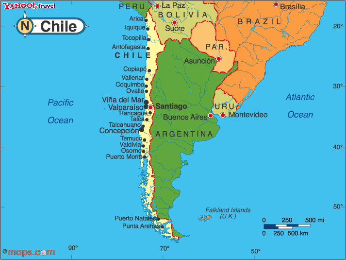
Folks approaching from the world of graphic design often have the opposite problem than what jbkrygier described: instead of thinking of maps as pictures of the world, and needing to be persuaded that they are propositional images, they assume that maps are there to persuade, and need to be persuaded of the necessity of ground them in real, accurate data, scale, an appropriate projection, etc. I'm wildly overgeneralizing here, but I expect most readers who are from the world of map production have run into the designer who has assigned the equivalent of a landscape-shaped space for a map of Chile. On the other hand, I know I have been at times a less than ideal vendor for clients who wanted something that looked "less mappy." Mappy is what I do, mostly.
If anything, cartographers need to think more about maps as pictures. I just got done reading a very interesting little book by the illustrator Molly Bang, which purports to show how picture composition forms the emotional content of a picture. Very simple, but quite effective; reminded me of Scott McCloud on comic book composition. A lot of well-balanced practitioners swear by Edwin Tufte.
The problem is, we as cartographers are blocked by the basic nature of cartographic maps from truly thinking about them as pictures. It's not a part of how we are supposed to think. More on this later. I need to go...
I actually rather like that "aura of authority" a map can have. It's one of the things that drew me to cartography. But when I look at other cartographers (and at myself, though that is never a trustworthy exercise), I don't see power-mongering. I see if anything bafflement at the power-based critiques of modern carto-critics. I think a lot of us see ourselves as like librarians, or scriptorium workers. Our first job is not to create power for ourselves (or for our Fearless Leader, whomever that may be), although of course our product may be framed to serve that purpose. Our job is to translate the World into something intelligible and navigable. That aura does not reflect a power of dominion, as Denis Wood et al have suggested. Power is not always power. Wood's urging the People to take maps' power into their own hands is something people have always done. A map are like a stage setting: We take it and when it is laid out before us, we can—anyone can—make arguments upon its surface.
Returning to jbkrygier’s point (that his students actually do need to be disillusioned of the idea that the map is the territory, and for that reason the map-as-proposition-not-representation idea makes a lot of sense): as I was driving around in the snow here today (finally), it occurred to me how this felt like the ongoing gritting of teeth between cartography people and graphic design people, when our professional lives intersect.
Folks approaching from the world of graphic design often have the opposite problem than what jbkrygier described: instead of thinking of maps as pictures of the world, and needing to be persuaded that they are propositional images, they assume that maps are there to persuade, and need to be persuaded of the necessity of ground them in real, accurate data, scale, an appropriate projection, etc. I'm wildly overgeneralizing here, but I expect most readers who are from the world of map production have run into the designer who has assigned the equivalent of a landscape-shaped space for a map of Chile. On the other hand, I know I have been at times a less than ideal vendor for clients who wanted something that looked "less mappy." Mappy is what I do, mostly.
If anything, cartographers need to think more about maps as pictures. I just got done reading a very interesting little book by the illustrator Molly Bang, which purports to show how picture composition forms the emotional content of a picture. Very simple, but quite effective; reminded me of Scott McCloud on comic book composition. A lot of well-balanced practitioners swear by Edwin Tufte.
The problem is, we as cartographers are blocked by the basic nature of cartographic maps from truly thinking about them as pictures. It's not a part of how we are supposed to think. More on this later. I need to go...
Friday, January 5, 2007
Maps maps maps
I make maps for a living. I get up in the morning, go to work, sit down at my desk and make maps, or do back-end work for making maps, or edit my company's catalog which is mostly maps.
I go to map conferences (OK, I go to one map conference. I don't get out much.), where people talk about map-making techniques. Sometimes, to my great fascination, people talk about what maps are.
So what the heck are maps? My latest conception, which came about after doing some reading on Hokusai, the great, idiosyncratic Japanese printmaker and painter, has to do with traditions. In the west, the phrase "artistic tradition" is coincident with the baggage carried by the "fine arts" (see separate blog rant to come on maps and art), so I will simply posit "picture-making" as a broader field within which maps form a tradition.
There are those (hi Denis) who have proposed that maps are not pictures or representations at all. I find the argument baffling. I think what they are arguing is that there is a disconnect between reality on the ground and the expression of that reality on a map. But that disconnect exists with all representations and pictures. Even photographs. I think the problem lies not in defining maps as pictures, but in narrowly defining pictures as direct representations of optical phenomena. Pictures cover such a broad range of expressions... assembly diagrams and product beauty shots; cut-paper silhouettes and mug shots; petroglyphs and Mark Rothko paintings; my four-year-old's picture of a toilet on fire and 9/11's falling man.
Another part of the problem in talking about map ontology is the way we in cartogrphy have responded to charges of cultural imperialism. Instead of saying, "Here is a limited field within which we practice," we have opened up the definition of map to include all sorts of things which lie well outside the cartographic mainstream. Marshall Islands stick-charts. Performative geographies. Tibetan mandalas. All fascinating, all potentially useful eye-openers to us map-makers. But...
One of the things I was interested in about Hokusai is the way he studied western and Chinese techniques yet is clearly still within the Japanese picturing tradition. This is of course nothing new: outside influences happen in every cultural tradition no matter how conservative the gatekeepers. What struck me is how strong his received tradition was, and how clearly identifiable. He lived within closed Japan for most of his life, and his pictures are now iconic of Japanese visual identity.
I think we map-makers could learn from this. Instead of tearing down the tradition of cartography, simply accept that it is a tradition (one of many), with a somewhat more limited reach than every expression of geographic space created by anyone anywhere, and work within that tradition, while acknowledging and experimenting with techniques form outside it.
I go to map conferences (OK, I go to one map conference. I don't get out much.), where people talk about map-making techniques. Sometimes, to my great fascination, people talk about what maps are.
So what the heck are maps? My latest conception, which came about after doing some reading on Hokusai, the great, idiosyncratic Japanese printmaker and painter, has to do with traditions. In the west, the phrase "artistic tradition" is coincident with the baggage carried by the "fine arts" (see separate blog rant to come on maps and art), so I will simply posit "picture-making" as a broader field within which maps form a tradition.
There are those (hi Denis) who have proposed that maps are not pictures or representations at all. I find the argument baffling. I think what they are arguing is that there is a disconnect between reality on the ground and the expression of that reality on a map. But that disconnect exists with all representations and pictures. Even photographs. I think the problem lies not in defining maps as pictures, but in narrowly defining pictures as direct representations of optical phenomena. Pictures cover such a broad range of expressions... assembly diagrams and product beauty shots; cut-paper silhouettes and mug shots; petroglyphs and Mark Rothko paintings; my four-year-old's picture of a toilet on fire and 9/11's falling man.
Another part of the problem in talking about map ontology is the way we in cartogrphy have responded to charges of cultural imperialism. Instead of saying, "Here is a limited field within which we practice," we have opened up the definition of map to include all sorts of things which lie well outside the cartographic mainstream. Marshall Islands stick-charts. Performative geographies. Tibetan mandalas. All fascinating, all potentially useful eye-openers to us map-makers. But...
One of the things I was interested in about Hokusai is the way he studied western and Chinese techniques yet is clearly still within the Japanese picturing tradition. This is of course nothing new: outside influences happen in every cultural tradition no matter how conservative the gatekeepers. What struck me is how strong his received tradition was, and how clearly identifiable. He lived within closed Japan for most of his life, and his pictures are now iconic of Japanese visual identity.
I think we map-makers could learn from this. Instead of tearing down the tradition of cartography, simply accept that it is a tradition (one of many), with a somewhat more limited reach than every expression of geographic space created by anyone anywhere, and work within that tradition, while acknowledging and experimenting with techniques form outside it.
Subscribe to:
Posts (Atom)