Thinking of world maps as exercises in imagination is like placing yourself in a universe before Galileo and Copernicus, where the sun went around the earth. The world today is surveyed, measured, imaged, and the picture of the “Blue Marble” is a staple image in every child’s visual vocabulary. We know what the world looks like from above, so why do our world maps not look like that world?
The history of humans actually seeing the world from above is very recent. Balloon photography began in the 1860’s (a grainy photograph of Boston from 1860 is the oldest surviving aerial photo), and airplane photography really hit its stride during World War I. The first photos of earth from space emerged in the 1960s (it is interesting to note that images that do look a lot like earth from space began to emerge before the real images; see Richard Harrison Edes’ World War II-era views created for Fortune Magazine). So most of the world map styles we are familiar with are based not on how the earth actually looks form above, but on the imaginations of the map-makers in what “the world” would look like.
I put “the world” in quotes, because most world maps are not imagined optical views of the Earth (as historic bird’s eye views are imagined optical views of locations), but are more like religious or cosmographic views, with characteristics that reflect optical characteristics and other elements that reflect abstract, non-optical visualization. Does that make sense? A world map from 300 years ago shows coastlines that should more-or-less conform to those coastlines viewed form above, and hill-picture representation of mountain ranges as viewed from the side. On the other hand, it will represent the equator and national boundaries, neither of which are visible from above.
Such a mixture seems problematic for us in part because we think of abstract and representational as separate schools of picture-making. But consider Christian religious art of the Renaissance and before, and how it often mixes portraiture of patrons with pictures of the Virgin Mary and/or saints. The pictures are not suggesting that the patrons actually were in the physical presence of the Madonna who looked like that and sat in a throne of this type. The role of life-likeness was different in the era before science, evidence and fact dominated the intellectual world. As I said, it’s a hard mind-set to get ourselves into...
The reason I think it is useful for us to get our head into this space (or into equaivalent spaces from any number of other cultures), is that it repositions “accuracy.” We are used in our culture to thinking of accuracy as being the same as semblance, and it isn’t. Spatial accuracy is essential for good cartography, but visual semblance is not; this is one of the main distinguishing characteristics of cartographic maps as a visual form.
When we think about maps as pictures then, instead of reflexively turning to landscape painting or aerial views, we should look at pictures which also have this quality of accuracy without semblance. In Western culture, this is probably most visible in information graphics (graphs, diagrams, charts, and so forth), a field map-makers already feel a lot of sympathy with.
But we also should be looking at non-western traditions, in particular illustrations of religious or cosomological structure. These can be painstakingly precise (see Tibetan sand mandalas and Navajo sand painting), but are not measured against semblance of another visual object. They are also built to describe abstract symmetries and alignments, and as such can be seen as models of the sorts of visual description we have to create every day... maps with pie-charts, cartograms, transit route maps, and even the super-simplified national or world maps we base so much of our small-scale work upon.
Sunday, January 28, 2007
Sunday, January 14, 2007
Graphic designers and cartographers are grinding their teeth
jbkrygier’s comment got me thinking about the gap between map perception and creation. It’s not a problem maps alone have — remember the classic Saturday Night Live William Shatner skit about Trekkies? In general, creators of images, texts, expressions of all kinds have to deal with people taking their creations and (in the creators' minds) misusing them. Or in any case blowing some aspects of them out of proportion.
I actually rather like that "aura of authority" a map can have. It's one of the things that drew me to cartography. But when I look at other cartographers (and at myself, though that is never a trustworthy exercise), I don't see power-mongering. I see if anything bafflement at the power-based critiques of modern carto-critics. I think a lot of us see ourselves as like librarians, or scriptorium workers. Our first job is not to create power for ourselves (or for our Fearless Leader, whomever that may be), although of course our product may be framed to serve that purpose. Our job is to translate the World into something intelligible and navigable. That aura does not reflect a power of dominion, as Denis Wood et al have suggested. Power is not always power. Wood's urging the People to take maps' power into their own hands is something people have always done. A map are like a stage setting: We take it and when it is laid out before us, we can—anyone can—make arguments upon its surface.
Returning to jbkrygier’s point (that his students actually do need to be disillusioned of the idea that the map is the territory, and for that reason the map-as-proposition-not-representation idea makes a lot of sense): as I was driving around in the snow here today (finally), it occurred to me how this felt like the ongoing gritting of teeth between cartography people and graphic design people, when our professional lives intersect.
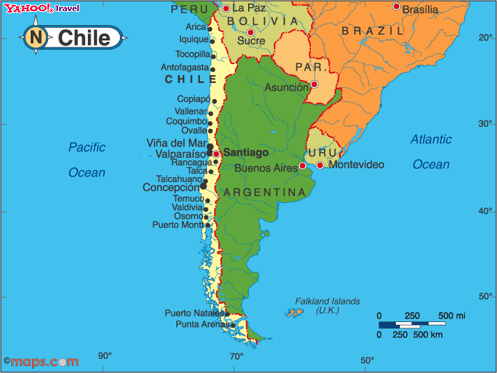
Folks approaching from the world of graphic design often have the opposite problem than what jbkrygier described: instead of thinking of maps as pictures of the world, and needing to be persuaded that they are propositional images, they assume that maps are there to persuade, and need to be persuaded of the necessity of ground them in real, accurate data, scale, an appropriate projection, etc. I'm wildly overgeneralizing here, but I expect most readers who are from the world of map production have run into the designer who has assigned the equivalent of a landscape-shaped space for a map of Chile. On the other hand, I know I have been at times a less than ideal vendor for clients who wanted something that looked "less mappy." Mappy is what I do, mostly.
If anything, cartographers need to think more about maps as pictures. I just got done reading a very interesting little book by the illustrator Molly Bang, which purports to show how picture composition forms the emotional content of a picture. Very simple, but quite effective; reminded me of Scott McCloud on comic book composition. A lot of well-balanced practitioners swear by Edwin Tufte.
The problem is, we as cartographers are blocked by the basic nature of cartographic maps from truly thinking about them as pictures. It's not a part of how we are supposed to think. More on this later. I need to go...
I actually rather like that "aura of authority" a map can have. It's one of the things that drew me to cartography. But when I look at other cartographers (and at myself, though that is never a trustworthy exercise), I don't see power-mongering. I see if anything bafflement at the power-based critiques of modern carto-critics. I think a lot of us see ourselves as like librarians, or scriptorium workers. Our first job is not to create power for ourselves (or for our Fearless Leader, whomever that may be), although of course our product may be framed to serve that purpose. Our job is to translate the World into something intelligible and navigable. That aura does not reflect a power of dominion, as Denis Wood et al have suggested. Power is not always power. Wood's urging the People to take maps' power into their own hands is something people have always done. A map are like a stage setting: We take it and when it is laid out before us, we can—anyone can—make arguments upon its surface.
Returning to jbkrygier’s point (that his students actually do need to be disillusioned of the idea that the map is the territory, and for that reason the map-as-proposition-not-representation idea makes a lot of sense): as I was driving around in the snow here today (finally), it occurred to me how this felt like the ongoing gritting of teeth between cartography people and graphic design people, when our professional lives intersect.
Folks approaching from the world of graphic design often have the opposite problem than what jbkrygier described: instead of thinking of maps as pictures of the world, and needing to be persuaded that they are propositional images, they assume that maps are there to persuade, and need to be persuaded of the necessity of ground them in real, accurate data, scale, an appropriate projection, etc. I'm wildly overgeneralizing here, but I expect most readers who are from the world of map production have run into the designer who has assigned the equivalent of a landscape-shaped space for a map of Chile. On the other hand, I know I have been at times a less than ideal vendor for clients who wanted something that looked "less mappy." Mappy is what I do, mostly.
If anything, cartographers need to think more about maps as pictures. I just got done reading a very interesting little book by the illustrator Molly Bang, which purports to show how picture composition forms the emotional content of a picture. Very simple, but quite effective; reminded me of Scott McCloud on comic book composition. A lot of well-balanced practitioners swear by Edwin Tufte.
The problem is, we as cartographers are blocked by the basic nature of cartographic maps from truly thinking about them as pictures. It's not a part of how we are supposed to think. More on this later. I need to go...
Thursday, January 11, 2007
Cartography=maps? nyet.
The core problem with almost any conversation about maps and what they are is that there are multiple sets meanings for the word, which, while related (nested even), do differ. Here’s my nomination of a list of “ontological domains” people may be referring to when they talk about maps:
In the broadest sense, a map is a multi-dimensional (i.e. it can be two-dimensional in form, it can be three-dimensional; it can be animated and thus be four-dimensional) abstraction (i.e. it is not simply raw sensory data, but has been interpreted) of a conceptual or physical space (i.e. it refers to something other than itself). Besides the more usual usages of “map,” such usages as “mind-maps,” “linguistic mapping,” and maps of conceptual spaces like the internet or the cosmographic structure of a religious system all fall into this broadest of categories. This is the sort of over-broad definition used by many of the most theoretical discussants, and leads to many interesting byways of semiotics and such. Because it contains so much, it is also practically useless as a definition when it comes to discussing practical mapping techniques.
The next smaller meaning-space is one where the subject of the map is the surface of a planetary body (most often the earth, but there are maps of several other planets and moons). These representations may be three dimensional, but they essentially refer to geographic space. This space is essentially defined in human terms: it refers to the space we move about in. Because of this, it is always represented as a reduction in scale, and usually a significant reduction.
We are approaching the most common usage of map, but we’re not quite there yet, as we have entered the area of cross-cultural “mapping” traditions, and it’s here I have the biggest issue. People have made all sorts of representations of geographic space over the years and across the miles. Often-cited examples of decidedly non-western traditions include Marshall-Island stick maps, Aboriginal Australian bark paintings, Native American pictographic narratives, and Hawaiian performative place-based ceremonies. All these transmit and store knowledge about geographic space, and a good case has been made that excluding them from the “table” in discussing space has been an effective way of disenfranchising “primitive” peoples (see the excellent Maps are Territories: Science is an Atlas by David Turnbull). Even where the geographic tradition is closer to western modalities, as with pre-Western Japanese or Chinese “maps,” modern western-oriented mapping sees mainly inaccurate, “ bad maps,” and wonders how such an advanced civilization could have not developed good mapping techniques (see “Reinterpreting Traditional Chinese Geographical Maps,” by Cordell D. K. Yee in The History of Cartography, volume 2, book 2).
The problem is, we have come to see the modern map, the cartographic map, as the definition of a “good map.” There are good reasons for this. The values of consistent scale and projection, quantitative accuracy based on scientific survey, and clean, easy-to-read design all lead (if done right) to a product that can be picked up and used by anyone used to using maps. For all that the discussion of maps as power had focused on the vertical power structures involved in their publication (who makes the map claims the land), the modern cartographic map also has a leveling, democratic quality, certainly compared to traditions like the Hawaiian or Australian ones, where knowledge of the land is transmitted only to those properly initiated.
As I said in my previous post, I think the idea of tradition would be a useful one for us cartographers to absorb. On one hand, it pulls us down a notch: we are not the only tradition. On the other hand, it gives us a theoretical place to stand: we are a tradition, with an established way of doing and seeing things. It is, I hope, a living tradition, but one whose conservative look and feel should be respected.
When we cartographers talk about “making maps,” we know we are talking about this last, limited definition of “map,” but we don’t want ro be accused of cartographic cultural imperialism. If anything, we are excited by the adoption of modern cartographic techniques as a form of empowerment by formerly colonized peoples. I do anyway. Empowerment by distributed GIS is a cliché by now, but it got that way because it’s true. And ultimately it fulfills the democratic potential cartographic maps have had from the get-go.
But what do we call the other things? the stick-charts, or even the things that look like maps but were not made in the cartographic tradition?
I think a key is to recognize that much of our claimed western map heritage is really just as foreign in social context as these obviously foreign non-western images. Five hundred years ago, the maps we see today as part of the cartographic tradition were treated quite differently. Cartography, in the form of scientific mapping programs, really started only in the late eighteenth century, though the tradition was coming together for maybe a century prior (see The Mapmaker’s Quest by David Buisseret). Even today, there is a vast body of things that aren’t cartographic (stick-map locators, cartoon maps, map “art” using recognizable shapes but no scientific survey content...). Affected by our tradition, but not of it.
So to be clear, let’s think of the broader world both of other culture’s material, and that produced in the western world outside of cartography, as maps. Instead of declaring cartography dead, let’s reclaim our territory as a cartographic tradition within the world of maps. Cartography better not be dead; it still has a vital job to do. That's the next entry.
Friday, January 5, 2007
Maps maps maps
I make maps for a living. I get up in the morning, go to work, sit down at my desk and make maps, or do back-end work for making maps, or edit my company's catalog which is mostly maps.
I go to map conferences (OK, I go to one map conference. I don't get out much.), where people talk about map-making techniques. Sometimes, to my great fascination, people talk about what maps are.
So what the heck are maps? My latest conception, which came about after doing some reading on Hokusai, the great, idiosyncratic Japanese printmaker and painter, has to do with traditions. In the west, the phrase "artistic tradition" is coincident with the baggage carried by the "fine arts" (see separate blog rant to come on maps and art), so I will simply posit "picture-making" as a broader field within which maps form a tradition.
There are those (hi Denis) who have proposed that maps are not pictures or representations at all. I find the argument baffling. I think what they are arguing is that there is a disconnect between reality on the ground and the expression of that reality on a map. But that disconnect exists with all representations and pictures. Even photographs. I think the problem lies not in defining maps as pictures, but in narrowly defining pictures as direct representations of optical phenomena. Pictures cover such a broad range of expressions... assembly diagrams and product beauty shots; cut-paper silhouettes and mug shots; petroglyphs and Mark Rothko paintings; my four-year-old's picture of a toilet on fire and 9/11's falling man.
Another part of the problem in talking about map ontology is the way we in cartogrphy have responded to charges of cultural imperialism. Instead of saying, "Here is a limited field within which we practice," we have opened up the definition of map to include all sorts of things which lie well outside the cartographic mainstream. Marshall Islands stick-charts. Performative geographies. Tibetan mandalas. All fascinating, all potentially useful eye-openers to us map-makers. But...
One of the things I was interested in about Hokusai is the way he studied western and Chinese techniques yet is clearly still within the Japanese picturing tradition. This is of course nothing new: outside influences happen in every cultural tradition no matter how conservative the gatekeepers. What struck me is how strong his received tradition was, and how clearly identifiable. He lived within closed Japan for most of his life, and his pictures are now iconic of Japanese visual identity.
I think we map-makers could learn from this. Instead of tearing down the tradition of cartography, simply accept that it is a tradition (one of many), with a somewhat more limited reach than every expression of geographic space created by anyone anywhere, and work within that tradition, while acknowledging and experimenting with techniques form outside it.
Subscribe to:
Posts (Atom)