Showing posts with label maps. Show all posts

Thursday, October 10, 2013

Maps for Strangers

My paper for NACIS, delivered October 10, 2013:


I think there is a fundamental misunderstanding in how we view maps for land navigation—road maps, street maps, and topographic maps. This misunderstanding colors what we think the historical place of such maps is, and how we view the role of maps in the new mobile era.

Here's the problem: when we say a map is a travel map or a visitors map, we assume that the map itself—the laying out of the landscape—is the means by which a stranger will figure out how to get from point A to point B.  Are maps the best, most fundamental way to find a path? I want to argue that they are not, that the two-dimensional “mappiness” we take for granted is essentially irrelevant to that process, and that we are now witnessing the devolution of that idea—the idea that maps are how you ought to find your way—and its replacement by the resurgence of the itinerary as the foremost tool for wayfinding.

I grew up with this image, from Peter Spier's 1967 picture book London Bridge is Falling Down, illustrating the old nursery rhyme:

See-saw, sacradown, 
Which is the way to London Town?
One foot up, and the other foot down
That is the way to London town!

See-saw, jack in the hedge,
Which is the way to London Bridge?
Put on your shoes and away you trudge
That is the way to London Bridge

The rhyme, and some aspects of the scene pictured, are in fact spot on in showing how people traveled before stage coaches and railroads. People walked, or rode. But they didn't, as far as we know, customarily take a map with them until well into the nineteenth century, and even then it would be a topographic map to guide in hiking or bicycling, not more conventional town-to-town road travel. Instead people used a combination of an itinerary, a prepared list of points one should travel to in order, and, as here, asking people the best way to get to the next point.

Catherine Delano Smith tracks the emergence of European, especially British, maps that relate to travel from late Middle Ages through the eighteenth century in her chapter "Milieus of Mobility" in Cartographies of Travel and Navigation. What she finds are that while some maps that show travel information, they were not tools for travelers on the move. Early strip maps were parts of portfolios with their own agenda of promoting local prosperity, and purchased by wealthy collectors. Other early network maps may have been used to plot itineraries, but the itineraries themselves consistently form the heart of how travelers made sense of any specific, longer journey. They were the linear framework within which one customarily then made up the details of the journey along the way, by asking for local information.

The key point I want to emphasize here, is that it is not the two-dimensional sense of a whole landscape that travelers needed. What they were intent on was their path through that landscape. Any other information may have been potentially interesting or at least diverting, but with the exception of triangulating by distant landmarks, they were inconsequential for the purposes of navigating.

It's been demonstrated by a number of people, especially Jim Akerman, the editor of the book that Smith's chapter is part of, that modern American route networks developed in the early 20th Century as part of the improvement and development of roads. Thus the opening of the Lincoln Highway 100 years ago this year spurred improvement of the existing roadways it used and signing them in common. Back and forth, these three tasks—designation and signing, mapping, and physical improvement—created the American network of Interstate, US, state, county and local roads we live within today.

This iterative development in the US may have blinded us, at least somewhat, to the difference between a route and a road, a designation vs. a piece of pavement. Modern vehicles' dependence on paved surfaces—not as extreme as railways, but still pretty strict—makes drivers forget that the network of roads is a subset of possible routes, in a way that foot-travelers never did. As Smith notes, before the modernization of roads and fights over the commons in the 17th century, traveling out across meadows was not seen as trespassing, but as the usual way of things. This is still true in parts of the British Isles, notably in the highlands of Scotland, where there are few linear rights of way and the law generally favors the right to cross open land.

We can get a taste of the older way of thinking in terms of itineraries, by looking at early auto guides like The American Automobile Association's Blue Books, which were popular motoring guides before the First World War. This was how you got from city to city before routes were blazed—indeed many of the very earliest road markings were made by the publishers of such guides to help their buyers find their way. And note that it doesn’t work entirely without maps—but that maps are clearly subordinate information to the detailed directions.

So why do we use maps today? Part of it is that our idea of a destination changed along with the motorcar. One no longer rode from a railroad terminus in Milwaukee to a railroad terminus in Chicago, but from one house in one part of the state to another, over a road network where one had to make choices many more times than on a rail network. And those choices, in America, are mostly anonymous crossroads rather than named places, as in Europe. America’s road system, especially in the center of the country, is based on an artificial grid constructed before European settlement, rather than organic, point-to-point networking.

So, while American road development focused on routes, even down to the local level, European roads and mapping used an already well-developed system of ways between towns and named places. Today, American road signs emphasize the route numbers and names, while European road signs emphasize destinations. In Europe, topographic maps formed much more of the basis of early road mapping, as navigation was much more a matter of finding one's way over an existing network of roads and lanes that connected named villages and towns, and less on following a developing system of routes.

I think also that the idea of maps’ primacy comes out of a desire for efficiency on the part of information providers. If we are going to produce a product in large editions that aids navigation, it needs to serve everyone with every conceivable route. But this does not mean that maps are what people wanted. The popularity of routing services like the American Automobile Association’s Trip-Tik program, or this knockoff concept by Universal Printing for a competitor to AAA, should indicate that really what people wanted is a linear route. Maps provide useful information, but they require the extra step from users of extracting that linear route out of the web of lines across the landscape. We have used maps because they work acceptably in huge single editions, and that gave oil companies, and later map retailers, something cheap to give or to sell people.

No more. This spring, I got lost in Hamilton Township, New Jersey. I got to an intersection with a CVS pharmacy, a RiteAid pharmacy, a 7-11 and a BP service station. And in those four stores on three corners, there was one map—not one map for sale, but one map, period, and it was a ten year old county atlas in the clearance bin at RiteAid.

As cartographers, we look at the mapping in Google and Bing, but I think this isn't what people are choosing over paper maps. It's the itineraries, the turn-by-turn directions. That's my hunch, anyway. What I see from the centuries before the oil company map, as described by Smith, tells me that people really want and  need this, and that on our modern road network, what online map services and GPS direction can deliver in terms of custom point-to-point itineraries, delivered on a uniform, one-size-fits all background, is simply better. It certainly beats this, a 1952 map marked up by a AAA advisor.

The dominance of printed maps for land navigation was a detour, a really big one-time glitch on the way to improving the itinerary.

So. Where does that leave us, the map makers? I talked earlier about our having made a mistake in thinking about the place of maps, and you may think this finishes that line of discussion, but every mistake has two sides. Maps are not the central communicative medium for wayfinding, but they are a central tool for something else. They allow us to construct a more coherent sense of place.

Itinerary: line, journey. Map: area, place.

In 1983, I spent a month in London, and took a bunch of walks. I had destinations, but the process of exploring the city by winding my way through it, was wonderful. And I specifically remember back in the dorm room at night, going back over my route on this Bartholomew’s London Plan map, realizing connections I hadn’t realized I’d made—walking one day around the back of a building I’d been inside the day before; passing by a tube stop I’d rumbled through the week before. Approaching Admiralty Arch first from the front, then from the back. I used the map to get un-lost a few times, but what I remember most is constructing a two-dimensional memory of the city after the fact on top of this dense artwork.

When we travel—when I travel—I am aware of how I essentially ignore large swaths of territory I am traveling through. I don't think this is just a product of the motor age, though the hermetically sealed automobile has emphasized this phenomenon. The plain fact is, most of the time we don't care much about the space we travel through—we just want to get through it. But we have a different relationship with the places where we stop. When we stop travel for a rest break, we move around, even if it's to get a sense of the relationship between the car park, our motel room, and the office. This most rudimentary geography sets up an understanding of space in more than one dimension, giving us a field within which we can carry out our "settled" functions of eating, sleeping, eliminating, washing, and maintaining our physical goods.

This is the kind of territory which, if it is complex enough that we can't easily hold it in our heads, we want a map for.

J.B. Harley was right on top of this understanding when he wrote his essay, “The Map as Biography.” To him, the map in question, a 1904 topographic sheet of Newton Abbot in Devonshire, reveals familiar truths to him: the history of an English town in its layers of development; the history of British mapmaking in the surveyors and draftspersons who compiled and published the map; and finally his own history, memories of a long residence, a marriage, births and deaths and burials. He wrote the essay after he had left Newton Abbot to live in Milwaukee, so it truly was an aide memoire to him, a reminder of where he had deeply been from. When David Woodward memorialized his colleague and this essay in a broadsheet for the History of Cartography project, he went a bit further, and talked about maps, and this map in particular, as a repository for memory.

Strangers in a territory—true strangers—don’t have these memories, and so I want to suggest that maps are fundamentally not for strangers. They may call out aspects of a familiar place we did not realize. They may correct misunderstandings our limited ground-based perspective gave us. But their real value is giving us a framework on which to construct our own familiarity—not from ground zero, but from some pieces of already-existing memory or knowledge. One must be familiar with a place in some way to fully make use of a map.

There’s a chimera I've been chasing since I started making maps: the idea that a map could somehow transmit poetic, profound sense of place. I’ve made a variety of arguments why it just isn’t so, mostly centered around how the construction of the fine arts and of cartography are incompatible. So here’s another reason:

We are all strangers to our audience. It's not just us. Almost every piece of published, broadcast, or publicly performed work operates this way. But a lot of work in other forms—memoir or poetry or landscape painting—slips a little trick in, creating, for the duration of the audience’s experience, the illusion that something personal, even intimate, has been shared. The subject might be actually personal, as in a memoir, or it might be fictional. But this is not the default condition for mass-disseminated media: this illusion of familiarity must be constructed by the author and/or performer and then agreed to by the audience. Now, the creator of this personal work may in fact be speaking truth, and we may be reading something personal. But the connection, the actual relationship between any individual audience member and the artist, is illusory. Of this fact all sorts of awkward fan encounters are born.

What we makers of modern maps do generally avoids this: we present what users take as simple, impersonal facts. But as Harley notes, it is upon these facts that a profound sense of place can be constructed by the audience. This is what we potentially have to offer: not a million people with one text. Instead, a toolset on which a million people create their own texts.

And this is why I so loved Becky Cooper’s Mapping Manhattan project: a blank map, handed to people to draw their own relationship to the most important island in America. it’s simple, it’s brilliant, and to me it’s a template for where we recorders of our geography need to go. The book at first seems to show a series of maps, but I suggest we should better look at it without the assumption that each new image is a separate map. These are each examples of the placement of individual memory upon a common map—the visualization of the internal processes all of use when we use maps as repositories of memory. This is how people at root use and want to use maps. It’s up to us to create maps that most effectively allow people to do that.

That is where this paper ended on Tuesday, but after a day at NACIS, I want to add a postrscript.

When we assume ahead of time what our maps must be made of, we pass on to our users assumptions about what kinds of texts, what kinds of memories, are permissible in the stories they are going to tell. This outline of Manhattan gives permission for a huge variety of responses. If Becky Cooper had handed her New Yorkers a URL to a mashup site where they could pin responses in digital form on a detailed OpenStreetMap zoomable base, would we have ended up with nearly as interesting and rich a set of responses? 

If we build our maps, our bases for public conversation, on data—if we ground our understandings insistently on data-driven mapping, we end up excluding whole classes of memory, of communication. To me this is  real challenge: from a data-driven perspective, there are centrally important modes of human understanding that are just too sloppy and vague to be admissible. The way we cartographers have learned to think excludes sloppiness. And, yes, sloppy thinking within a precise, complex system has arguably gotten us into the political mess we're in right now. But only part of the problem is the sloppy thinkers insisting on equal standing. The other part of the problem is the insistence of non-sloppy thinkers that we don't have a fully legitimate place for this sloppiness. 

I think that's the root problem: our insistence that our human response to the world around us not be sloppy. When we insist on this, we have overstepped our place.

Saturday, August 24, 2013

Why decoration is important

There's a piece of Dalia Varanka's paper on the rise of the "Plain Style" in mapping around 1700 that has been gnawing at me. I referred to it in my recent essay on cartography and aesthetics in Cartographic Perspectives, but I think it deserves some deeper pulling-out.

[FYI, Varanka's paper is not available online: it's “The manly map: the English construction of gender in early modern cartography.” in Gender and Landscape: Renegotiating the Moral Landscape, edited by J. Carubia, L. Dowler, and B. Szczygiel. New York/London: Routledge.]

The piece that's bugging me is this: why is decoration trivial? I take it as a given, something that doesn't need further explanation: form follows function, and decoration is an add-on. Flourishes, trills, scrollwork and so on, are less "honest," in this view, than plain, unadorned, prose. Manly prose—you know, like Hemingway.

See what I mean? This thread of appearance being false, of truth being deep, runs to the bone in our culture. And it isn't true everywhere: saving "face" is seen crucial in many cultures. Even in our culture, there is a long and deep divide which has not been entirely settled, between those who think God cares about what we do and those who think what we are is essential: in Christian terms, works and faith.


Outwardness and inwardness were a part of my formative pop-psych thinking: I remember M&M's being a popular metaphor in high school: the hard exterior and the soft, delicate inside. The astrological notions of sun-sign (true inner self) and ascendant (what you feel the need to appear like) also made an appearance.

That latter, though I do not believe in the functional idea (that when you were born determines who you are) does I think provide a way to think of decoration as essential. Because it says that how you want (or even need) to be seen is itself an essential part of who you are. It's not a "fake" thing you can change at will. Some seemings will fit you better than others, just as your true inner self is what it is.

Adolph Loos' Ornament and Crime posited that ornament was a waste of time, because fashion changes. And we have come to see outward presentation as synonymous with fashion. Being changeable, fashion is not trusted. We want our truths to remain on a single, unwavering course. That's what faith is: sticking with your allegiance to a person or an idea no matter what. Even if, as with Mother Teresa, you never actually achieve that numinous moment, you still get counted as saintly if you stick with a strict goodness.

But some ornament is not especially prone to fashion. Traditions include ornament, whether it be in religious decoration, folk dances and music, or traditional costume. Even when radical technological change steps in (as with aniline dyes and many fiber traditions), there is seen to be a deep well of sameness and conformity that is valued, even as it is all about "unnecessary" patterning on functional objects.

So why is ornament important? I think of patterns of tile, or of geometric grillwork, that I see when passing time. I especially notice it in bathrooms. These provide a place for the mind to work and rest simultaneously. A field of play, perhaps. They are certainly better for the mind than an utterly blank slate (or tile). We like to play off of patterns. I do anyway. And so decoration, on surfaces and tools we use every day, give us something to work with.

It's the idea of play that I think is the stickler here. The arguments against ornament are mostly serious. Ornament is seen as silly, a distraction perhaps. And I suppose in places where total concentration is necessary, it is. The question is, should our lives be spent in that kind of concentration? I don't think that's very healthy-sounding. We need to build in play, just to keep ourselves sane. Our lives can't be built so thoroughly on importance and concentration; there's a reason U.S. Presidents seem to age so quickly.

Decoration, then, keeps us young. Perhaps. Or at least keeps us from getting too old, too fast.

What I see as a deeper problem, then, is not that we need decoration, but that we need to build our lives where decoration and underlying form come together inseparably. Again, the astrological model is one I hold up: that the healthiest approach to decoration is that form and function are in fact one, that the object and the patterns we see in it are the same, not a core and an add-on. That the M&M is one candy, not two parts adhered together.

And this doesn't mean (in maps for example) that every pixel must carry inward meaning. Some marks do not mean anything about the core structure of a place. Sometimes, they are texture. But that texture is part of what the place is about. That paisley print is not coded with instructions; it's an abstract design. But that design, if it fits, becomes part of what you are when you are wearing it. And that texture, that added noise, as it were, even though it is not consciously spoken by you or even understood by you, is part of what you are.

I think this is the root of our modernist discomfort with decoration: we want to be in control. Just like the English Empiricists who promulgated the Plain Style, we want to exercise our conscious power over as much as we can, and to eliminate that which we do not consciously control. This obsession with maintaining an order we can understand is arrogant in the extreme. And in the end it will kill what we love, which is not entirely under our command. That decoration, that patterning we make, turns out to be an imitation of the vast, intricate, impossible to entirely comprehend web of processes that keeps us and this world alive.

Thursday, August 8, 2013

Function and Beauty (In Defense of Useless Maps) - new essay

In a new essay for Cartographic Perspectives, the journal of the North American Cartographic Information Society, called "Function and Beauty (In Defense of Useless Maps)", I discuss some potential pitfalls and opportunities in discussing maps in terms of aesthetics. It ends up dipping heavily into some wider issues. I hope you all enjoy! All comments welcome.

Thursday, October 18, 2012

On Critique

This is a paper I gave (am giving?) at NACIS's annual meeting in Portland, Oregon. I hope you will find it of use.

---

Critique is basically looking at something someone has made, usually in the presence of the maker, and talking about why it does and doesn’t work. Critique is a core methodology for teaching fine arts, which was my college major. Critiques have become a core part of NACIS, including the Cartotalk gallery, the Map-off, and roundtable map talks. Whether it’s with colleagues or with clients, we all engage in feedback. We all need the outside point of view that allows us to see our maps freshly.

However, I want to start by reading from a 1997 interview with Stephen Sondheim, from the TV series Inside the Actors Studio. For those unfamiliar with Sondheim, he is probably the greatest living writer of Broadway musicals, with his heyday in the 1970s and 1980s.

INTERVIEWER
When you were ten and your parents divorced, your mother moved to Pennsylvania and it was there at the age of eleven that you encountered Jimmy Hammerstein and were welcomed into the family of Oscar and Dorothy Hammerstein. I understand you’ve said that if Hammerstein had been a geologist, you would have become a geologist.


STEPHEN SONDHEIM
Yes. He was a surrogate father and a mentor to me up until his death. When I was fifteen, I wrote a show for George School, the Friends school I went to. It was called “By George” and was about the students and the faculty. I was convinced that Rodgers and Hammerstein couldn’t wait to produce it, so I gave it to Oscar and asked him to read it as if he didn’t know me. I went to bed dreaming of my name in lights on Broadway, and when I was summoned to his house the next day he asked, Do you really want me to treat this as if I didn’t know you? Oh yes, I said, to which he replied, In that case, it’s the worst thing I’ve ever read. He saw me blanch and continued, I didn’t say it was untalented, but let’s look at it. He proceeded to discuss it as if it were a serious piece. He started right from the first stage direction; and I’ve often said, at the risk of hyperbole, that I probably learned more about writing songs that afternoon than I learned the rest of my life. He taught me how to structure a song, what a character was, what a scene was; he taught me how to tell a story, how not to tell a story, how to make stage directions practical.

Of course when you’re fifteen you’re a sponge. I soaked it all up and I still practice the principles he taught me that afternoon. From then on, until the day he died, I showed him everything I wrote, and eventually had the Oedipal thrill of being able to criticize his lyrics, which was a generous thing for him to let me do.


This is a different kind of critique than most of us will ever get. I'm not going to suggest that the Oscar Hammerstein of maps— I don’t know who that would that be anyway—is going to offer you the secrets of his or her trade. But I want to hold up this example for clues how we can position ourselves best to receive and give critique. Specifically, I think there are social barriers that often keep our critiques from being what they could be.

The first thing I want to call your attention to, is that Sondheim and Hammerstein were crystal clear about the field in which they were playing. Hammerstein wrote Broadway musicals, and Sondheim wanted to win at that very specific game. If he had wanted to write a Gilbert and Sullivan operetta, or an art-song cycle, or radio jingles, Hammerstein might have been supportive, but would not have been able to offer such specific advice, grounded in experience. Same if Sondheim had wanted to write something new and revolutionary, to jump tracks. Sondheim wanted to perform within a specific, evolving but established tradition.

Too often in cartography, we act as if “knowing how to make maps” is a singular tradition. And there isa basic unity to modern cartography. But I make urban navigational maps as my primary specialty, with a secondary specialty making regional thematic point maps, in both cases within the context of a for-profit map publishing company. Pretty much everything else I do is a kind of experiment. I shouldn’t really be trying to pass myself off as an expert on choropleth maps, or mountain hiking maps, or geological maps, or any other of a hundred other map types.

That phrase “map type” sounds like it’s all about definitional categories, but it’s also about context—how do you sell the map, or otherwise get it out to the audience. Broadway musicals were defined at least as much by the business structure of producing a show as by artistic theory. I can tell you this kind of issue is central to commercial map publishing, that actual cartography is only the most obvious part of the job. Whatever branch of the map world we’re in, we know this, but somehow in discussing cartography, it’s harder to bring that element of our work—call it the business end, maybe—into our critiques. Maybe it feels like some kind of sell-out, the tainting of pure mappage by the finger of mammon, or pandering to the public, or maybe it’s because we really don’t understand who we’re making maps for—we just keep making maps and dang it, the public keeps using them. But that public is who we’re making maps for, so if we pay as close attention as we can to how that public are being reached, it should help us make maps that do a better job.

Our audience—who we’re making the map for—is not just the end user. Hammerstein’s critique, if it was anything like his 1949 essay Notes on Lyrics, was focused not just on lyrics as text, or on the experience of the audience, but also on the work of the singer. His critique of Sondheim was broadly structural: how to compose a scene, how to structure a song. Your map is probably part of a presentation your client or organization will be making to someone. It’s in no way shameful to factor that wider performance into your critique. It’s not a sell-out unless you personally cannot stomach the client or organization’s message.

---

I was a studio art student in college as I mentioned earlier, and critique remains a crucial part of studio education. For me, the frame for critique was as much collegial as professorial, about getting students to talk critically about each others’ work. I want to mention an interesting book from 2001, Why Art Cannot Be Taught: A Handbook for Art Students, by James Elkins. It’s actually just about the only literature on modern post-secondary art teaching. It makes the point that because fine art is no longer about following specific technical traditions—learning to paint like your master—the idea that art teachers can critique from a position of stylistic authority breaks down: we expect art students to find an original voice, rather than be measured on how they can speak in the copied voice of the teacher, or of canonic Old Masters. And so while art teachers are still teachers, and often lead a discussion, they focus in part on students learning from each other. This is an oversimplification of course, but that to me is the nut of the situation. And thus the title of Elkins book, Why Art Cannot Be Taught

We don’t really have the problem of lack of technical traditions in cartography—there is still a clearly defined broad visual language in our field, and the ideal of self-expression doesn’t loom large. Cartographers largely share the same tools and tricks. And yet in our critiques, in forums like NACIS and CartoTalk, we maintain a strong collegial quality: even when there are clearly newbies in the room, asking for basic feedback, we feel like we need to respect their work. And we do, but too often, we also feel the need to be nice. We don’t want to hurt feelings by putting ourselves in the position of Hammerstein, telling people that their map is garbage.

This is not as much of a problem with clients. Clients are usually willing to tell you when a map you made for them is not what they had planned on paying you for. The trouble is, they often have a hard time telling you what they want done differently. They probably believe they don’t know map design, and so they don’t know what is possible. Often they have no design background: “This map is too, you know, blah-ish, or too, kind of, hard to read, or just not PUNCHy enough.... You figure it out. You’re the cartographer.”

And so we find ourselves in this weird position: we are the authority on making maps—the stand-in for Hammerstein—this is why they hired us after all; and they are the ones with the authority of the checkbook who aren’t happy with what we are producing for them. And that can be really awkward.

More than ten years ago, I was at a party at my brother's house, and a friend of his, really insistently, came to talk with me. I'd never met him before, but he was happy to tell me at length why my map stunk. It was Professor Pathfinder’s Downtown Denver, and although my brother still cringes at the memory, it was a really useful critique, because it centered not around how I was violating some preconceived standards, but on how he had a lousy experience trying to use my map.

You cannot deny any user their experience. You can try to cast it as illegitimate or ill-informed—an outlier experience—but you can’t say they didn’t have it. And to me, that’s the best way out of the incoherent client critique trap: focus on their experience and how that isn’t working. You’re then essentially doing what I said earlier: working within a shared audience-centered environment.

But what about the niceness trap? Most people I’ve dealt with are not as clear and direct as my brother’s friend. They simultaneously want to be friendly, and think your map has serious issues. Critiques often come from positions of power—teachers, bosses or clients—and despite stereotyping, most people aren’t interested in playing the heavy with people they have a continuing relationship with. I think it’s the fear of being seen as mean that inspires a lot of forced collegiality.

Hammerstein was in his late 40s, a very successful lyricist. Sondheim was 15, clearly ambitious, but also clearly in awe of Hammerstein. But Sondheim was a family friend. He taught the elder Hammerstein to play chess. He spent the weekend there a lot. Hammerstein was “Uncle Ocky” to him, a surrogate father.

There was a moment at the beginning of the critique, and it almost seems like a formality, but I think it’s actually central. Hammerstein says, “Do you really want me to treat this as if I didn’t know you?” and Sondheim replies, “Oh yes.” What they’re doing is agreeing to play-act. By agreeing that Hammerstein will treat this script by his young friend as if he wasn’t a friend, they’ve set up a privileged space, an afternoon-long social parenthesis, where Hammerstein can impart some really important information. Without that parenthesis, with Sondheim being the crushed teenager and Hammerstein the rejecting parent-figure, would that exchange of information have been possible? I don’t think so.

And this is the weird crux of hearing critique: You have to be able to pretend the critiquer really knows what he or she is talking about—and you have to be able to trust them. And this is where that social parenthesis is so useful. It’s a kind of suspension of belief, from which both participants are released at the end of the discussion.

When you’re in a position of direct power—employer and employee, teacher and student—that parenthesis is really hard to come by, which I think is actually a great case for seeking outside critique. It’s hard to pretend that the person giving you the grade is coming at you as a total stranger, or that you aren’t judging your employee on their performance when you are in fact... judging their performance.

This is where that most common comment I got from fellow cartographers on critique comes from: “focus on the work, not the person.” I want to suggest two approaches here. The first is the focus on user experience. Then your judgments aren’t about you, the judge, it’s about an amorphous “them”. The second, which I like even better, partly because it seems more honest, is to focus on the Work, with a capital W. How do we get better maps to exist, in general? This makes the critique a joint exercise. It also takes performance pressure off that pathetic excuse for a map you have sitting between you. You still don’t want it to fail, but it’s failure is part of a process, not the failed summit of Everest.

If you put these two things together—the social parenthesis, and a focus on user experience—you come up with an interesting model that’s not too different from any good performance: the audience enters the performance space not knowing the performer, but being mostly willing to trust that the performer will reveal something important or at least interesting. The performer’s job is simultaneously to connect—to reward the audience trust with a sense that they are in fact on our side—and to tell us something new. We then leave the performance changed.

---

And then there’s the critique we all desire, deep-down.

Folks who have learned the lesson of positive reinforcement will start off by telling you how great your map is, and then say “BUT”... And then you’ll get to the real point of the critique— what isn’t working and how to make it work. Other times, you’ll get thumbs-up for doing something which you’ve been promoting you do well. Call these “affirmations”, perhaps. They’re great, they boost the ego, but they aren’t news. They don’t change you.

And every so often, you’ll get a comment that’s like a little moment of grace. You’ll be praised for something that you weren’t really paying attention to.

I had this great moment on CartoTalk, a couple years ago, where Derek Tonn made some really lovely comment about my hand at label placement. Totally out of nowhere, and I had certainly never thought, “well, if all else fails, I can always go into label placement, because I’m good at it.” What that little unexpected bit of praise did was to make me pay attention to something I was doing and taking for granted. There’s a singing and dancing friend of mine who is great about this: when I first knew him, he just seemed a little overexcited about stuff, but now I can see that what he’s doing is pointing out moments we might just take for granted, things like, “Wasn’t that just a perfect night and it was so cool to see four sets of parents and kids each leading songs.”

Like I said, it’s like grace, in that you can’t force it. Having to find nice things to say doesn’t work when you just don’t see them.

And the key to seeing them is to give yourself time. This is one of the biggest problems with most critiques: they’re scheduled, and you’re in busy, get-it-done-on-budget mode. A really good critique requires a kind of mental state that allows the critiquer to wander over the work, and allow observations, both positive and negative, to develop. And it’s in that time and space that you can find surprises, and find structures and qualities the map-maker wasn’t looking for, and then suss those out a little bit internally before you blurt them out.

To conclude:

Some of you may be familiar with the TV show Mystery Science Theater 3000. The frame story doesn’t matter here: the central premise is that a bad movie is shown to a human and his robot friends (they’re puppets). We see them in silhouette, and they wisecrack their way through the show, taking it down a usually well-deserved notch or three.

So we have a performance—the bad movie—that fails. Then we have another performance on top of that, a commentary on failure and how we can still enjoy a work that is bad. The wisecrackers enter the performance ready to mock, and we are happy to mock with them—it’s a comedy, as most bearable works about failure are. Most of us do not want to be that bad movie, and if the movie is our friend’s work, we don’t want to be the wisecrackers. We really don’t want to be in a comedy when it comes to work with people we care about.

But we are in a comedy. We all make bad maps, one way or another—or, to speak more gently, deeply imperfect maps. We all have to look at imperfect maps other people make. We don’t have to be wise-cracking jerks about it, but if we aren’t able to admit this basic fact, we’ll get nowhere: that we are all at least partly Stephen Sondheim, aged 15—full of potential, not necessarily knowing what we’re doing, wanting desperately to please and to be successful, wanting people to think we’re more than competent, and always in need of some good critique.

Saturday, October 15, 2011

Physical Maps

I'm recovering from NACIS 2011, which as usual was wonderful and rich as a source of ideas and techniques and wonderful conversations with fellow cartographers and mapheads.

The thing that kept coming back to me this year is how we often leave aside the idea that maps are physical objects, or at least are experienced as physical objects. It's easy in this electronic world to get caught up in the content that streams to us via our screens, and learn to ignore the screen itself, or at least allow it to fall to a different level of consciousness.

A map is our word for a kind of information transmission: we talk about map makers and map users, about map-generating technology, the language of maps, the meaning and power of maps. Every link in that chain, from the physical ground of our discussion, through the physical means of recording, the physicality even of computers and their electronic guts, exists in physical form. It is grounded in stuff.

This used to be so self-evident as to be an absurd statement. Phrases like "buying a map" or "reading a map," "folding a map" or "publishing a map," represented physical processes that were the primary concern of map makers and users. In fact, we as a map culture were so caught up in these physicalities, that it was kind of a surprise and a jolt to be reminded a generation ago that there was something abstract, ineffable, and grounded in symbol about map-making.

This is to me one of the huge changes the digital revolution has brought about. We now mostly accept that maps are images, texts, arguments, or propositions. The public no longer talks about "folding that paper up like a road map" because our children have no more idea what we're talking about than they do when older folks talk about "dialing someone" on the telephone.

We need to be reminded of the physicality of maps. At a session in NACIS, I made the point that a technique of cross-hatching that Patrick Kennelly presented (really cool idea, by the way), would carry more of the rich texture of the art prints he was using as examples, if he actually made copper plate intaglio prints from them. And the conversation then turned to how you could add texture in Photoshop and so make them look more like old prints. And I held my tongue. The point is, an actual copper plate print, in its physicality, looks and feels different than even the most interesting plotter print—they may look the same on the projection screen at a conference, but their physical appearance in the world is not the same. Physicality matters.

Friday, December 31, 2010

Great Work of Time

Who hasn't run into old Shelley's "Ozymandias" in an English Lit class, the ruined claim of eternity disintegrating back into sand. We think we are free of the pride of our permanence—the mortality of ourselves and our endeavors gets drilled into us over and over: hubris and vanity and the problem of seeking immortality (cf. Voldemort).

I just finished rereading John Crowley's Great Work of Time, a compact, melancholy and thorough dismantling of the idea of an eternal empire. It's a time travel story in baldest terms—one where the attempt to make the British Empire truly eternal, the protector of world peace and preventer of the horrors of the twentieth century, turns out to make the world go horribly wrong: the future fills with monsters and angels, a strange and unnatural stasis that in the end is imagined as a silent forest underwater, forever still and unchanging. The angels and the wise magi that the messing with time produces, do not want to have been created. They long for death.

We mapmakers make some claim of permanence—more modest than eternity, but what I take away from Crowley's book is the false seductiveness of the idea that what lasts beyond our lives lasts forever. We don't know what happens after "The End," and so we imagine a universe that never ends, an empire on which the sun never sets. An immortal soul. Streets that are somehow permanent. But someday the streets in my neighborhood will become meaningless. It might be a very very long time (in doing research this week I realized I will likely live to see the basic streeet pattern of Harvard Square celebrate its 500th anniversary), but there is no such thing as "forever", only "over the horizon." I don't think there is anything, anyway.

Maps only act as a way of contrasting relatively transient with relatively permanent phenomena: the states shapes remain the same as votes move from bloe to red and back again. Streets remain the same as taxi routes wiggle back and forth across them. Continents retain their rough outlines as glaciers push forward and retreat.

We need ground to stand on—a stage as I've said before, here—in order to make our performances and arguments. People who have attempted to eliminate that stage in the name of acknowledgining our impermanence have unleashed a peculiar kind of madness we see in some kinds of modern art and philosophy. Eliminate permanence, and there's no "there" there, as Ms Stein said. Perhaps the answer is to sadly acknowledge that our stage, our permanence, is itself impermanent, and find a platform that fits our lives, and the terms of permanence we can find— the land that stays more-or-less the same between glaciations, the nation that for a while retains the same basic shape, the family and friendship we have for the span we are lucky enough to have it.

Happy New Year, all. Here's to what permanence we can muster in the coming year, and what good we can perform upon that permanence.

Sunday, December 12, 2010

The International Date Line

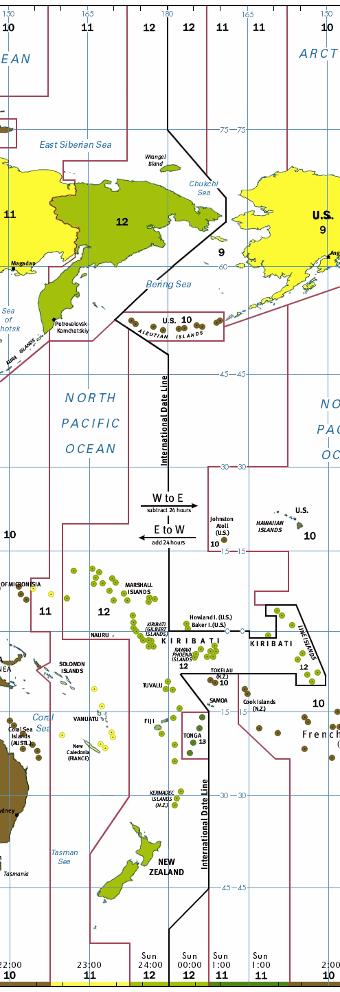
My son asked a random back-of-the-car question the other day, about whether there was a place where the day changed too, not just the time. There is, of course, and it's the International Date Line, more-or-less located at 180° longitude, opposite the globe from the Greenwich meridian. (the picture attached is from Wikipedia)

What I found interesting about the question, though, was how the idea of such a line requires a leap of how we think about time. For most of us, time is local: our makers are sunrise, noon, sunset, midnight. Like the Archimedean, Earth-centered model of the universe, and like earth-navel cosmologies, it makes "us and ours" the center of all things, both in space and time.

20 years ago, I took a course at Carleton College from the late Mike Casper, "Revolutions in Physics," that was mocked by some as "Physics for Poets." Which isn't really fair, although I can see the case that it really was as much a history of science course as anything. The course was divided into three sections: the Archimedean, earth-centered universe, the Newtonian universe, and the Einsteinian universe. The goal of each was to immerse the students in what historically were comprehensive worldviews. And it worked. It was fascinating how useful the oldest model, the one we've mocked as "wrong" since grade school, really is.

It's of course incorrect that the sun goes around the earth, but there's a lot to learn about seasons and the sun's movement in the sky if you think that way. And I became aware that I simply had not paid that much attention to how the sun moves in the sky over the years. For example, that it is always due east or west at 6 o'clock (either one) local time. Or that the angle of the sun's path is constant in the same location, but that the constant-angled path moves up and down vertically with the seasons in relation to the horizon. I dunno, maybe everyone else got that from day one, but it was new to this college student and it was cool, and it depended on thinking locally.

The Copernican/Newtonian model of the universe that shifts this around. Suddenly, we're on a planet, and really there is only one day, and it keeps rotating around the globe—or rather, the globe keeps turning and the day is the glow from the star at the center of our solar system. Instead of the sun as a clock that keeps our time, we are fixed points on a moving sphere, which keeps its time in turning us and everything else in the world.

And it's in this world that International Date Lines become necessary.

Interestingly, it wasn't scientists who first proposed such a line. It was an 11th-century Jewish scholar, who was concerned that all the Jews in the diaspora should observe the same Sabbath, and so proposed a system which kept the same day-observance for all of Asia, and made a break somewhere in the Pacific. The "Circumnavigator's Paradox" was in fact a real paradox, discussed in the late middle ages (see the excellent History of the International Date Line for much of the source material in this post): Apparently it surfaced when Magellan arrived at the Spanish outpost in the Philippines, having come from the east by way of Cape Horn, and disgareed with the Spanish officers there, who had come from the west, via the Cape of Good Hope. Their dates, of course, were off by one.

In a world where one set of grandparents is an hour earlier and another is an hour later, and where we can fly to Europe where it's six hours later, it's commonplace to think about time zones. But it was not always so. It was not until railroads needed to keep precise time in their east-west journeys that the need for standard time became apparent. Before the railroads, punctuality was enforced within local communities. A parishioner coming to church on time, or a worker arriving at the mill, or any citizen keeping any of the other appointment-keeping arrangements we make, either had to judge by the sun, or by the bells of the church tower, or later by the local-time clock or sundial, how close they were going to cut it. And travel, by foot or horse, essentially re-set the clock.

By instituting standard time, we essentially said, railroad time is more important than where the sun stands in our sky.

And much the same thing, on a global level, happens with the International Date Line: we are forced to recognize that this is a round, whole planet, which moves in one time, simultaneously. And for better or worse, this means we depend less on what we see—here and now over our heads—to regulate our lives by.

Thursday, October 28, 2010

Volcanoes are not the same

I had a longish list of subjects to talk about in the wake of the NACIS conference, but what I keep coming back to again and again is the uncomfortable feeling that "map" is somehow the wrong ontology—the wrong conceptual category—for what I am really interested in.

What I mean is the sense that's been growing in me, kind of under the surface of my everyday cartographic life, that the thing I claim to specialize in is like a dolphin leaping in and out of the water. Or maybe more accurately, it's the way we call certain geologic phenomena "volcanoes" as if they're one sort of thing, based on what they look like, rather than what processes they represent.

"Map," especially when equated with modern scientific cartography, is a form of expression. It's a technique and style of drawing. And on the surface it seems to have a generally unified subject matter: the surface of our planet. That at least is the definition you get if you abandon the the search for a categorical definition and fall back on a cognitive, examplar-based definition (see my earlier blog post.

But in the end this posits maps as a kind of object, rather than a kind of function. And if you look at a tradition of mapping, any mapping, you end up finding curious gaps: I'm thinking especially of the gaps in early maps for navigation, which Catherine Delano Smith documented in her article in Cartographies of Travel and Navigation (James Akerman, editor), which I reviewed in Cartographic Perspectives a couple years ago (PDF here). As I summarized:
Catherine Delano Smith, in the second article, discusses the origins of the modern road network map in medieval and early-modern European itineraries. These were largely textual until the late eighteenth century and did not evolve into visual tools for independent way finding until the nineteenth century. This came as a revelation to me; an almost map-free travel network is hard to imagine today, but Smith makes it clear that the use of maps as a basic tool for land travel is a modern development.
And yet, there was clearly navigational knowledge being passed along. Presumably it was passed along orally, and more importantly through repeated action: palmers learned the pilgrims route by first being an assistant to a pilgrimage's guide, then eventually leading groups themselves.

So if we think of maps as function rather than object, they become part of a continuum with other sorts of things. All sorts of things. All sorts of unrelated things. "Geographical knowledge," as a concept is an ontological pea soup [insert joke about AAG conferences here] and not all of it relates to maps at all... as those who have looked at maps for expressions of poetic sense of space have found to their detriment—some kinds of knowledge are in fact mutually exclusive of cartography—again see my discussion of cartography and the fine arts (PDF here)

No, I think what we have is something a little like "publishing," an interesting term used to describe a particular way of distributing knowledge. Like maps, some kinds of knowledge bob up and down in and out of publishing, while retaining their integrity: poetry is poetry whether it is recited in a non-literate society, scribbled privately in a diary, or published in books.

There are some classes of knowledge that sometimes pass through maps, and which we've gotten used to almost equating with maps. Navigation, for example. Human territory. The shape and texture of the surface of the earth. How people are scattered around the planet. How would we talk about these ideas without maps?

We use the word "house" to describe a thing by its function: wasps' nests, tepees, chateaux, the inner sanctum of a temple. Can we think about doing that with maps? Can we, the map people. let go of the term in the way that most writers end up doing the work and not worshiping the object? Can we think about:

Guides: communicators and communications to help strangers find their way through unfamiliar territory—and most of our territory is unfamiliar, even most of the cities we call home. Hedberg Maps make maps that have helped me find things in my home town of which I was unaware. But so have pieces of narrative prose, signs and markings on pavement, conversations, tours, and just walking around and learning the landscape through repetitive exploration.

Territory markers: It's the claiming of areas of land that generally gets cartocritics most het up. The way people can draw a line across a map and so divide up the world, without actual engagement with the land itself. But people were claiming territory long before cartography; indeed the bloody wars of the early early modern period— the Crusades, the Hundred Years War—were fought largely based on non-graphic ways of understanding the lay of the land. We mark our territories in a variety of ways, both with "permanent" physical barriers and boundary markers, and by social communication. As with navigation, signs and other "on the ground" graphic and textual clues are a kind of counterpart to mapping, providing a "civilised" alternative to dogs chasing you out of the yard.

Travelers tales: One of the things maps do is tell us something about territories we've never visited. The stories modern cartography tells are mostly grounded in documentary factuality, but the way we can read shaded relief or a map of ruins can stir the imagination in the same way that tales of Prester John and the Unipods did people centuries ago. And there is no shortage of other material that does the same: nature documentaries, travel photography, the stories we hear from friends...

Economic planning tools: statistical maps are mostly about (in a broad sense) the economy. By this I refer the original source of the word "economy", the Greek word οἶκος — house, household or family. Oἰκονομία means "household management," and the way we understand what is where in our increasingly broad collective household is part of a larger set of tools that gets people fed, warm, clothed, and otherwise provided for. In this sense, a statistical map is part of the same toolset as a spreadsheet, a shipping container, or the Federal Reserve's policy: they are all about recording and moving value.

I could surely come up with more, but then so could you. The point is, we cartographers do end up often hanging onto our technical expertise at our proclaimed specialty. And maps are a valuable kind of tool to let us look at the world from a step back, to place ourselves in an ordered version of space, to make sense. But we would do well to be aware (and beware) how much we are focusing on the sense rather than the thing we are making sense of.

Thursday, October 21, 2010

Tecumseh Sparrow Spivet

[Note: this article presumes reading the book, and contains spoilers]

I have a few things to say about The Selected Works of T.S. Spivet.

The novel was a best-seller when it came out in June of 2009, and initially received press attention because of the monumental advance the author Reif Larsen received for this first novel ($1 million). The reviews were mixed: most reviewers wanted very much to like such an unusually eloquent and evocative voice, but several (notably the New York Times and Washington Post reviewers) found the latter part of the book, especially the parts where T.S. Spivet visits Washington, disappointing.

Well, to be honest, they weren't my favorite bits either. But then, they also weren't T.S.'s favorite, and it kind of shows. The book, like most maps, doesn't entirely work as a linear narrative. It's a puzzle in which the linear progression of time and plot, while certainly straightforward (this is no Memento), is not the dominant, salient feature. Really, the most important moment is about 2/3 of the way through, when, at the conclusion of reading his mother's reconstruction of his great-grandmother's early life story, she abruptly cuts off the narrative, writing the name of T.S.'s dead brother, who perhaps died as she was writing. In this sense, it's a little like the symmetry of Coleridge's "Rime of the Ancient Mariner", where the second half of the novel has the character working his way from that crux point, the nowhere of a midwestern wormhole, back to his family. Coleridge's Mariner's return journey also suffers somewhat...

The way T.S. simultaneously orbits his brother's death and avoids it that forms the central motion of the book. And an orbit is hardly a linear path: we return again and again to the same basic relationships: T.S.'s distant, formal relationship with both his scientist mother and cowboy father, his typically exasperated coexistence with both his living and deceased siblings, his obsession with drawing diagrams and maps as a way of making sense of the world, and the utter senselessness offered up by the world that he tries to map.

---
This is the second book about map people I've read this year. Unlike the author/subject of Map Addict (see my discussion here), the fictional narrator of this book is consumed by the promise of mapping and more generally of scientific study of the universe. It's appropriate that the character be a child—a prodigy with an disturbingly grown-up diction (and who has not known children with disturbingly grown-up diction)—but it is also notable, and lovely, to see a cameo appearance by Corlis Benefideo, the subject of Barry Lopez's short story "The Mappist" (see discussion here). And it's clear that Larsen wants his hero to be like the narrator's daughter in that story—the promise of a new generation who will humbly carry on the Work of mapping the world, piece by piece.

It's not how us cartographers usually see our role, any more than "making myths" being how novelists consciously view their craft as they go about it from day to day. But Larsen is pointing in this circular, spiraling book to the same basic sense Lopez pointed to: the humble recording and exploring and searching and the piece-by-piece processing of it all, is a kind of prayer to the universe. It's a kind of love.

So it really is a peculiar novel. It points toward what it's trying to say, leaving the largest points mostly unsaid, like notes at the edge of the map saying this destination is a certain distance further. We find a genius cartographer running into things that are unmappable and yet that mapping is his tool. We see a desire to be part of a great scientific enterprise crumbled into disillusionment, but not disillusionment with the enterprise, just with the clothes it has to wear—T.S. may be saying goodbye to the Smithsonian and to Washington, but not to the idea of the Smithsonian.

I keep seeing these sorts of orbits underlying some of my favorite books. The orbit in Diana Wynne Jones' Fire and Hemlock is deceptive—it's a love story that orbits a kind of modernist despair. Here, the obvious suppressed and not-so-suppressed grief over T.S. brother's death looks like the focus of the orbit. T.S. clearly thinks it's what he's circling. But in the end, what is revealed a kind of stubborn, slow trust that some of the world is comprehensible. Even the terrible, stupid meaninglessness of his brother's death. In the end, the author (and narrator) point towards the love of parent and child, the care even the most scientific of us end up showing each other, that he has been circling, unaware, for the entire novel.

Tuesday, July 6, 2010

Formality and Familiarity

[my apologies if this post is a bit of a dog's breakfast; I've spent too much time fussing over it. It probably should have been parsed out into a couple different posts. But there you are.]

It occurred to me, a few weeks ago, that maps are like a collective voice—the voice of a group—in the same way that all published second-person information are. One individual (or more likely, a small group) composes the material, with the idea that "anyone" (that is, anyone with understanding of the particular formal visual or text system) can fit themselves into the pilot's seat and bake that bread or find that highway. In a sense all communication creates a community, in that it means that more then one person has the same information, and this sort of communication is a subset of that.

Maps, recipes and other anonymous second-person communications also act as guides within a larger system. They are formal, though they may be couched in friendly, casual voice: you can make a handwritten-text map, or (as with Julia Child or Laurie Colwin) frame recipes with chatty, informal prose. But Julia Child and your local cartographer do not know anything about you personally. All they know is that you, their target audience, desire to learn to cook the things they describe, or to learn what you have to say about geographic space. As maker of a cookbook/map, you need to compose instructions that can be used by a cook in a small kitchen in Boston or a cabin in Montana, by a motorcyclist or Hummer driver,

BUT: the maker of s standard street map is NOT making their map for people trying to walk or drive cattle. One could say that cattle drivers are excluded. Much has been made of classist, racist, sexist, nationalist etc. exclusion from cartography. And the same thing could be said for Julia Child. You need a motor vehicle to really use a modern road map properly, and you need a kitchen to use a modern cookbook: there are basic tools that the cookbook and street map presume you will have.

But besides excluding, these tools also welcome in. They make it possible to join in a community—indeed they form that community—without first passing a human-administered sniff test: there is no catechism, no manners to learn, no bloodline to prove. This was Julia Child's genius: you don't have to have an outrageous French accent to cook good French food; you just have to understand the system. So the matter of exclusion becomes a matter either of personal economics (can't use that navigational chart... don't own a boat...), or a matter of choice (why would I want to cook French food? Can't stand the stuff).

---

I'm writing this on the Amtrak train down to Portland from Seattle. The train staff are settled in seats behind us, where they are chatting and griping about their jobs. When they make announcements, there is a forced informality to their patter: they are trying very hard to simultaneously sound professional and friendly. The divide between formality and familiarity is, as in much of American public life, confused.

I grew up in this informal American social environment. A lot of it is about denial of class divides: it is not OK in much of this country to set yourself above other fellow Americans (illegal immigrants are another matter). I find even the now-much-reduced sense of formality in Europe disconcerting, and I know Europeans find themselves disconcerted by American "friendliness."

But friendliness is not the same as familiarity. One may give a highly formal greeting that nonetheless makes the visitor very welcome, and one can be laid-back and rudely unwelcoming.

In an odd way, formality can be more friendly, especially where there is a divide in familiar social customs. The word "familiar" comes from the same root as "family" and implies a habitual rather than consciously learned set of behaviors. Where these habits are not ingrained, being plunged into a casual social situation can be very very awkward: rules are not spelled out, and in the everyday business of eating, going to the toilet, and simply sitting and relaxing, feelings are likely to be hurt.

But, of course, formality can be off-putting. I did not like the whole be-on-your-best-manners part of visiting my maternal grandparents. The silverware, the posture, the careful wordings... and in retrospect they were not that bad at all, pretty tolerant and gently corrective to their grandson.

The difference between formality as welcome and formality as barrier is in whether the formal system permits access to the habitual. A street map allows one to discover a network, but that same network can be learned (think new cabbies with their nose in the street atlas vs. old-timers who know the city streets by heart).

Where formality is destructive is where there is no gateway through to familiarity: Eliza Doolittle could learn to be a lady, but unless her Pakistani modern-day counterpart is truly judged by her habits, speech and carriage, her skin color will forever bar her. You can be as polite as you want to awful old Great-aunt Phyllis, but she will never let you see her heart, or see you as you are.

And where maps truly do provide a barrier, they too are a problem: where they are used to create ghettoes and bantustans and reservations, to clearly and unequivocally state that this sort of person will only be allowed here and here, to rationalize and clarify violent systems.

They are also a bar where formality becomes its own ingrained habit. This is the class bar: when you have grown up used to formal habits, you have an inherent, and unfair, social advantage over those who have had to learn the formal system, and for whom it will always be a foreign language.

My own take-home for this is that it is always best that a formal system like cartography remain a foreign language to all who use it; one may become fluent, but if it becomes the language in which you relax in your pajamas, then you need in a sense to recuse yourself from using it as a tool for power. You become a host, and ought not really claim this common land of formal systems as territory.

Tuesday, October 27, 2009

Summing up [maps]

I started doing a summing-up of where I've gotten to on this blog. The mappy part I got, I think, and is below. The Quakery part, not so much.

-----

We measure the earth.

Our measurements are a way of paying attention, but when we measure, we pay more attention to norms than to idiosyncratic instances: we see a series of things in the same category—"road" for example—rather than the peculiar ways individual houses are different. When we measure, we are finding something out about the world that is not peculiar to ourselves. Or at least, this is true when we measure using rulers and standard units of measurement

The result moves us away from a record of direct experience—and thus from a connection to that experience—and toward understanding of the world through an abstracted filter. This abstracted version of the world makes it possible to work with strangers, and so also makes possible an alienated, broadly-based, urban society. Thus measurement isn't all that different from language, which both allows us to communicate with those who do not share our direct experience, and cages our own experience.

By defining and categorizing, this measurement of the earth also makes it clear that we are different and separate from the earth. The measurer and the measured are supposed to be distinct. When we measure the earth and also when we name parts of the earth, we reinforce a sense of separation from the earth; measurement places a measuring tool between ourselves and the thing being measured. By contrast, direct repeated experience reinforces a sense of connectedness to the specific piece of ground we are experiencing. We don't need the measured version of a familiar territory, but measurements with new tools may reveal something new and unfamiliar within familiar territory.

Measuring also allows us to comprehend a scale of the earth that is outside our everyday experience. When we use the results of measurement to talk about a territory that stretches further than we can see, our a route past that bend in the road, we can talk about that route or territory not just as accumulations of places, but as entities of their own. It's no accident that small-scale maps and cosmological drawings often leach over into one another. Both describe spatial ideas that encompass, but are beyond, our moment-to-moment experience.

Tuesday, September 15, 2009

'Til Daddy Takes the T-Bird Away

Ingrid posted a passage on the fridge a while back from Malcolm Gladwell's book Outliers. The relevant passage is quoted here. It basically makes the case that it is practice—massive amounts of practice—rather than talent, that make brilliant musicians. You of course have to have some inborn ability to fit the instrument, but the 10,000 to 20,000 hours of practice, the 20-30 hours/week, that's what does the trick.

The word "practice" came out of a continental usage meaning "striving or endeavoring" into its earliest English use as the carrying out of a profession, especially medicine and law. It quickly spread to mean "The actual application or use of an idea, belief, or method, as opposed to the theory or principles of it" (OED, definition 2a), and then "The habitual doing or carrying on of something" (OED, definition 3a). It has come to connote a regularly repeated activity which is reserved into a protected, private space in life, not subject to conventional human power structures. You don't do it for cash or your household or your family. Practice is about you and something other than you, and no-one else gets in the way.

I decided to become an art major the end of my freshman year in college wothout having taken any art classes. I did it because I looked at all the activities I had been doing that year, and the ones that I just did and did and paid no attention to time passing were mostly working on design and art projects. I figured that was a good indicator of the sort of work I could happily put a major's worth of effort into. It turns out I was right. I was happy to work—to practice—for hours on end.

Now, by the end of the next three years, I had of course come nowhere near the 20,000 hours of practice mentioned above. 3000 I might believe, but that's probably pushing it; I had other classes and activities. And I mostly gave up the disciplines of the studio arts within a couple years after graduating. Turns out I am not so good on self-motivation if there isn't someone (like a teacher or a client or an audience) I'm preparing work for. Just how I'm built. But I got into map-making, and I felt a similar sense of "I could do this forever."

I think map-making is fun.

And I think the key to getting to that 20,000 hours has to be "fun". Either that or some seriously twisted obsessive behavior combined with strong elder-pressure. But if they didn't love doing it, would they keep doing it? If they didn't at least some of the time wake up in the morning and say, "Wait, you're going to pay me to go out and do this? Cool!" I feel that way about map-making still a lot of the time. Ingrid says she feels that way about writing.

As Dr Seuss says, "If you never did, you should./These things are fun and fun is good."

But pursuit of fun also covers a kind of Peter Pan escape-from-reality way of approaching things which is the opposite of what I'm talking about. What is the difference between following the pleasure of a practice that works for you, and following sensual pleasures? The difference is whether the practice requires work from you; whether you are being held up to a standard.

Some friends were over and in the course of the evening's conversation, the question emerged, "so why do you go to Meeting if you aren't a theist?" Which is a good question, a good opening. And one of the answers, perhaps surprisingly, is "because it's fun." Or something like fun. It's fun in the sense that the practice rewards me. I come away with more than I went in with, usually.

But conversely I think of those awful grownups who try to make kids have fun, with a forced-march kind of determination—there was a gift to Roo when he was very small that was a clock that talked in a plummy, Judi Dench English accent, saying "Let's have fun!" when you turned it on, and "Goodbye!" when you turned it on, which at age 1 was about all he could do. Over and over and over. "Let's have fun! Goodbye! Let's have fun! Goodbye! Let's have fun! Goodbye!" Given who it was from, we considered it a passive-aggressive gift and "forgot" it at grandma's house...

Maybe I'm just avoiding the obvious word because it sounds so over-the-top gushy: Joy. Fun you can use up and throw away, but joy you keep. Maybe I find joy in the work I do, and the practice of Friends meeting, and really much of what I do in my life (OK, cleaning the cat box and balancing the bank statements maybe not so much), without the trumpets sounding and shafts of light from above. Maybe that's what the practice is about.

Wednesday, September 9, 2009

The New Champion


I have a new winner in the Best Book About Maps category. It's called The Map Addict (you can also view a preview of the book from that link). It is written by Mike Parker, and it is very very good.

Mike Parker is English, and his personal obsession is Ordnance Survey mapping, but the way he describes life inside a map works just as well for those of us who grew up in America. He begins with the kind of obsessive map-travel many of us practised as children, wending our way through road and street maps. In Parker's case, it was the 1:50,000 Landranger Series, but I was picturing an 11-year-old me with my family's Hagstrom and Texaco road maps and a Goode's World Atlas. Parker was obsessed enough to shoplift nearly a complete set of Landrangers in his teens, and he acted as the family's (heck, the neighborhood's) navigator for his young adult life.

The book includes the requisite descriptions of recent cartographic history—the origins of the Ordnance Survey, Bartholomew's, and the A-Z maps—but it all comes back to what it is like to be a map person. He carefully takes down the old canard about men, women and maps ("men read maps, women follow along"). He takes on the dangers of satellite navigation with great good humor. And in the end he turns on his own map addiction, describing what it is like as a map obsessive to wander without a map, to be freed of knowing ahead of time exactly where you are.

A description of the book sounds like a random collection of interesting waypoints: the solar alignment of Milton Keynes, the most boring sheet of Ordnance Survey mapping, the sensuousness of raised-relief mapping, but throughout it, Mike inserts himself and reflects on how his relationship with maps informed and changed his relationship with the world as a whole. As a gay, pagan travel writer and TV commentator, many conventional Englishmen and women would see him as weird, but his relationship with maps is tied to a quite normal English domestic way of being: Enid Blyton stories and a nice cup of tea, and the world laid out comfortably surveyed. All adventures contained.

He talks about how a mappy way of thinking about the world can and does lead to a kind of cranky, even dangerous, sense of normality. Many of his heroes turned into cranks in their old age, and he alludes to a kind of proto-fascist mentality lurking in any well-settled society.

The book is witty, and it reminded me how important humor is in discussing the things I like to talk about here. Humor is a way of pointing sideways to uncomfortable things, and Parker does it so well, you may not even recognize the discomforts he is talking about. We would all do well to pay attention to that.

Saturday, July 4, 2009

Harley's article on his "Favourite Map" online

I've referred to J.B. Harley's article "My Favourite Map. The Map as Biography: Thoughts on Ordnance Survey Map, Six-Inch Sheet Devonshire CIX, SE, Newton Abbot" a few times. It was published in The Map Collector in 1978, and Kunstpedia.com is putting articles from that magazine online. I requested they add Harley's article and poof! Boudewijn Meijer did. Here it is! Wow, that was fast. Enjoy!

Tuesday, June 16, 2009

Pretty Maps

I've felt out of the loop for a few months, busy with other stuff. There was a thread recently in Carto-Talk about GIS folks and "pretty maps" that got me going. My response was:

It's the phrase "making the map pretty" that gets me. I don't make pretty maps. It's like saying that the fine arts are about pretty pictures.

The world of modern cartography isn't about pretty, though sometimes that is a pleasant side-effect. It's about clarity and effectiveness as a visualization tool. But the same things that make a picture pleasant to look at (pretty), are core parts of effective, clear communication: awareness of emphasis, harmony and contrast of color sets, attention paid to the framed shapes and to an overall sense of visual balance. What makes a good piece of modern cartography work is that attention to these things is not in the service of "pretty"—a vacuous word—but in the service of meaning and understanding.

I'm going to recommend an obscure book that really helped me parse this out, by one of my favorite illustrators, Molly Bang. It's called Picture This, and I really enjoyed it.

I think what people who talk about pretty maps don't get is that visual harmony is not the same as pimping your ride. I came to cartography from graphic design 19 years ago because I didn't want to do any more ride-pimping. There's a distrust of design in some quarters because it is, in the wider world, often used to deceive and entice; it's an advertising and marketing field in large part.

And so, I think, some people resist the idea of cartographic design because it sounds like covering up the data with some rhinestones and lipstick. They believe that a map that is "plain" and unadorned, is one which is most honest.

But what I think most folks don't realize is that "plain" is not the same as "lazy." Plain is just as much of a carefully crafted visual statement. I certainly have made that mistake in my personal life: I'm a lazy dresser, and I think I sometimes excuse myself by painting myself as "plain." The Amish put a fair amount of effort in preserving their sober dress: cleaning, ironing, etc. That's different from slapping on a pair of jeans and a t-shirt.

"Pretty" is a straw-man used by those who want to get out of making a map work visually, by equating attention to visual flow and structure with propagandistic manipulation. Good "plain" design is just as much work, and requires just as much attention to design as an effectively pimped-up map will.

Tuesday, May 12, 2009

True Stories

Fictions are stories that are admittedly not accurate reportings of the real world, but which are valued because they tell general truths about the world. Non-fictions are stories that are valued as accurate reportings on the world.

So far so good. But then we get into religious stories, where we fight each other over whether the stories are true or not. Fiercely.

Why is it important to us whether these stories are fact or fiction?

There's been a similar (if more restrained) fight in the map-theory world over the "truthiness" of maps, and I think a similar question here can be raised: why is it so important that maps be seen as a reflection of the "real world"? Here, the answer is clearer: we want an accurate portrayal of the earth so we can use it as the basis of discussion of the real world. If it's not accurate, we can't use it the way we want to.

Is the same thing true of religious stories? Fundamentalist approaches to religion take this tack: "Everything in my Scripture is literally true, so I can use that as my Certainty. That's my foundation, my bedrock." But less fundamentalist points of view still need a sense of certainty in their stories... they need to look at their scriptures not as myth, but as something closer to Truth.

I think what often happens is, religious truth goes in a different compartment than everyday truth. Because what is said in religious texts is largely about extraordinariness rather than repeatable-experiment reality, we can put them into a mental space that is neither "made up" nor "verifiable", but is instead "non-verifiable but believed in." And religious texts do contain material that, like good fiction, contains general truths about the world: morals, ethics, love, justice, the very idea of truth.

The reason maps and other reference materials carry that peculiar aura about them is that they can (within limits) be relied upon. That in doing this they satisfy a need says to me there is something inherent in humans that needs this foundation. When people then ascribe to maps a level of "objectivity" or "truth" that we cartographers are aware they don't warrant, this is not an indication that people are stupid. I think it's an indication that people are people.

Tuesday, March 10, 2009

Revisiting Tufte, Pt 2: In Defense of the Ridiculous

First off, please don't get me wrong. The man's a genius. Ed Tufte's books really are glorious explications of unspoken rules and structures in a world (information graphics) that's supposed to be all about clarity but is surprisingly opaque even to its experienced practitioners.

They're also a treasure trove of examples of information graphics and how to make them clearer.

I've been realizing as I revisit Tufte that his foundational structure is pretty well laid out in The Visual Display of Quantitative Information, the first of his "picture books". The other three books are essentially collections of add-on essays. There may be themes running through the books, but really each chapter stands alone quite well, referring to the original book and to other essays from all four volumes.

I was struck by a few other things:

1. data and texture
In Beautiful Evidence, in the chapter on "sparklines", he evokes the intensity of linework in older western artists, using a sample from a Dürer engraving. He evokes it, but I think he mis-describes it. In Tufte's vision, all marks are information—all ink is data. Tufte evokes the Renaissance artist and then moves on to Swiss mountain cartgoraphy, with its similarly intense linework, implying that the Swiss are in the same business.

It's revealing that Tufte chose Dürer to evoke instead of, for example, Rembrandt. Dürer, to our eyes, is fussy; the intensely engraved lines at once read as texture and as information: every mark has a feeling of intent, and the sum is a rich picture, full of recognizeable detail but still forming a coherent statement as a whole.

Rembrandt's etchings are no less detailed, and form no less of a statement, but each mark does not imply data in the same way Dürer can seem to. Rembrandt's marks, especially as he matured, are about texture. In the map world, we know that's a lot of what pulls a map together: texture. We want it to be meaningful, for that texture to itself carry meaning, but we need to remember that the holding-together of the map is what it's really there for, and that at a certain level it no longer carries specific data-meaning: at one scale the wobbles of a river-line are traced precisely, but at a certain point they only mean "the river isn't straight." They are texture, not data.

2. ridicule
I was struck at how Tufte uses ridicule as a weapon against the "enemy": Clarity is good, confusion is bad. If you're going to intentionally create a muddle, make it a clear muddle. And he picks good targets: the ineffective decision-making that led to the Challenger explosion, Powerpoint's limitations...

Here's the problem:

If we become afraid of ridicule, we will not push ourselves. Sometimes, like when launching a hugely expensive piece of equipment into outer space with seven humans aboard, careful is a really really good idea. But not all charts and statistics should carry this sort of load. That no-fun attitude is, maybe, why cartography ends up feeling so stilted sometimes.

I'm a believer in Sturgeon's Law, “Ninety percent of everything is crap.” Theodore Sturgeon was a science fiction writer. From Wikipedia:
The meaning of Sturgeon’s Law was explicitly detailed by Sturgeon himself. He made his original remarks in direct response to attacks against science fiction that used “the worst examples of the field for ammunition”. Using the same standards that categorize 90% of science fiction as trash, crud, or crap, it can be argued that 90% of film, literature, consumer goods, etc. are crap. In other words, the claim (or fact) that 90% of science fiction is crud is ultimately uninformative, because science fiction conforms to the same trends of quality as all other artforms do.
From my point of view, Tufte in using ridicule to fight against what he calls "chartjunk" is also throwing out the baby with the bathwater.

What baby? What bathwater?

3. In defense of texture and the Baroque
Tufte points to a graphic like this first in Envisioning Information as an example of an interesting use of simplification and distortion to allow comparison. Later, in Beautiful Evidence, he ridicules it for having all that extra texture, the knobby lakes and so forth. To me, this is a really beautiful and interesting graphic, something to strive for, not an eccentric maiden aunt. That texture and those extra squiggles don't communicate Really Useful Data, but they do present part of a sense of identity and character.

Tufte attacks information graphics with unnecessary framing, or with editorial illustration, and he uses egregious examples to do it with. But like Sturgeon says, there's lots of crap to go around. I want to look at some baroque graphics that work. Like the river-comparison chart, or historic illustrated maps. Tufte repeatedly quotes Jonathan Swift: "So, geographers in Afric maps,/With savage pictures fill their gaps/And o'er unhabitable downs/Place elephants for want of towns.").

You know, I like the elephants. I like illustrated maps when they are done well. There are lots of badly done "plain" maps, and Tufte is at his best when he's giving us a theoretical framework to work within in building that sort of graphic, but I think he falls down when he turns around and says that that sort of graphic is superior to baroque graphics.

Over and out for now.

Monday, January 26, 2009

Bad Reviews

Something I've been doing more recently is seeking out negative reviews of stuff I love. Positive reviews all sound alike ("such a wonderful piece of work, it moved me deeply in ways I am only beginning to explain"), but negative reviews can help you suss out what's really going in the experience of viewing a movie or reading a book.

I loved The Curious Case of Benjamin Button. The last few minutes left me bawling, sobbing uncontrollably. So I was really interested to hear from a friend that a friends of hers had hated it, had felt she was being manipulated, and that finding out it was the same director as Forrest Gump suddenly made it all make sense.

The point I take away is that any work of fiction has that manipulative quality to it: the author sets you up, the author puts the puck neatly between your legs. The question is, can you see the system of pulleys by which the puck actually travels into the net? And in the end, it's the willingness to be taken in we bring to the experience. What visible strings are we willing to ignore, and which ones just leave us stranded outside the movie, looking at how it was constructed.

Ingrid and I are working our way through Mary Rose O'Reilley's books. We've both finished The Barn at the End of the World, and loved it, and now she's mostly through The Love of Impermanent Things, and likes it too. I'm waiting my turn.

I doubt I would have read it without knowing Mary Rose from Meeting, without our friend Kit saying she was one of her favorite writers. And I fell for the book, fell into it, fell over it. So I went hunting for the negative reviews.

They were remarkably like the negative reviews for War is the Force That Gives Us Meaning: not enough structure, non-rigorous use of quoted literary material, and a general lack of direction. Which is absolutely right in both cases. Hedges and Mary Rose do not build rigorous arguments. In Hedges' case, his argument just builds in momentum until it's kind of overwhelming. For Mary Rose, there isn't an argument really, except perhaps an argument for sprituality as experiential, and the argument proceed not by any unifying rhetorical device but by the accumulation of 99 little chapters. Many of them feel like spoken ministry in Friends Meeting.

Something I value in what I read is a writer's approaching things from an experiential rather than a formal point of view, which is so totally opposite of what I do in my cartographic life. I enjoy the experience of formalizing and structuring the information (or more properly, coming to understand the underlying formal structure of the data), and of making that structure clearly visible and understood. But what I love to consume as a user of information is this purely experiential plunge-over-your-head-and-paddle-around stuff.

Interesting.