Tuesday, March 24, 2009

John Bachmann

I've mentioned John Bachmann before, but I should note my new article, in the current issue of Imprint. It's been a pet project of mine since 1999 (here's an older version of the paper I did for the New England American Studies Association, from 2001), and it's gratifying to see it looking so nice. Here's a summary:

John Bachmann was born in Switzerland around 1814 and died in Jersey City, New Jersey around 1894. John Reps writes "No finer artist of city views worked in America," and indeed Bachmann's bird's eye views are unique in the history of American views for their combination of artistic technique inherited from European landscape drawing, in which he was trained and worked in Paris, and the experimental sensibility he had in constructing his views from viewpoints he had never seen. His career saw the transition from one-color stone lithography through multiple-tint-stone techniques into zinc chromolithography, and from printed views as decoration and commemration to views as promotional and speculative documents. His views reflect not only the changing landscape of New York City and the other cities he drew, but the changing landscape of the American print world.
If you want to see more of his work, a good start is the Library of Congress collection, which is split between the Geography and Maps Division (bird's eye city views and Civil War panoramic maps) and the Prints and Photographs Division. Other significant collections on-line include the New York Public Library. Non-online collections with significant holdings include the New-York Historical Society, the Bibliotheque Nationale in Paris, the Historic New Orleans Collection, and the Museum of the City of New York.

Anyway, it's nice to finally see this bit of work done...

Sunday, March 15, 2009

True Love

Warning: this post assumes you have read Diane Wynne Jones's Fire and Hemlock. If you haven't, it will make very little sense, I suspect. Fair warning.
------

Here's a really weird thing I realized recently about Fire and Hemlock: It's a love story (in large part) in which no-one says "I love you."

Ever.

I used the Google Books version of the text, and searched for the word "love." The word appears 24 times in about 420-some pages of the paperback. Mostly it's people saying "Here, love" to Polly. Seb Leroy is rumored to be "in love with" Polly, and later offers to go with her in the "Tunnel of Love" at the carnival. The Dumas quartet signs a letter "with love from the Dumas Quartet." And When Polly plays Pierrot in the school play, Harlequin and Pierrot are discussed falling in love. Apart from that, the instances of the word are all "I'd love to!" and "He'll love this!"

But it's not that Jones doesn't have people trying to talk about love. They just always use different words: Ivy goes on about "happiness," at the end Tom talks about "seeing you" and Nina is boy-mad: "The rest of the time Nina pursued boys."

Laurel does not talk about love. Laurel is, in fact, incapable of real human love. One of the aspects of being of the Fair Folk. She takes, she enjoys, she uses—but she does not love. And her point of view infects the whole story from beginning to end.

---

I'm reaching the conclusion that the reason the ending of the book is so unsatisfying is that the real ending, the place it should have gone, is so depressing that Jones couldn't bear to go there. In order to save Tom, Polly really does have to let go of him. In doing so, she is in essence giving up her love. And in doing that, she is becoming not a little like Laurel. No technicalities, no "Nowhere is somewhere" word games.

The book, in avoiding actually talking about love—real love—swirls around a vortex. It's the pool at the bottom of the garden, which as Polly enters drains her of human emotion and connection, drains her of love.

---

Maybe afterwards, when Tom says "I want to see you anyway," they will be able to write stories together, to meet in that make-believe world where they explored being heroes together. But in the flesh-and-blood world, Tom used her, or tried to anyway. It may have been justifiable, but that's not the point. Polly's heartbreak, her teenaged jealousy of Mary Fields, which was so neatly erased by Laurel in making her "forget about Tom," has been unerased and revealed for the flawed and not-necessarily-based-on-the-real-Tom thing it was. Whatever relationship Polly and Tom go forward with, it will be tinged with the fact that they can never really trust each other the same way again.

---
It's not good to ask too many questions of love, to ask it to justify itself. Basing our decisions in love and life on the patterns we see can leave us blinded to patterns we don't see. That's the part of dancing that's impossible to explicitly teach, that rules can't touch, that explicit labels hide.

Tuesday, March 10, 2009

Revisiting Tufte, Pt 2: In Defense of the Ridiculous

First off, please don't get me wrong. The man's a genius. Ed Tufte's books really are glorious explications of unspoken rules and structures in a world (information graphics) that's supposed to be all about clarity but is surprisingly opaque even to its experienced practitioners.

They're also a treasure trove of examples of information graphics and how to make them clearer.

I've been realizing as I revisit Tufte that his foundational structure is pretty well laid out in The Visual Display of Quantitative Information, the first of his "picture books". The other three books are essentially collections of add-on essays. There may be themes running through the books, but really each chapter stands alone quite well, referring to the original book and to other essays from all four volumes.

I was struck by a few other things:
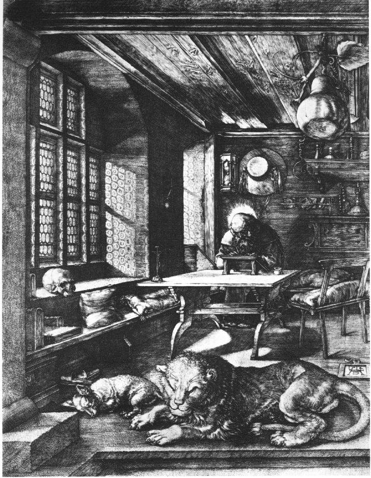
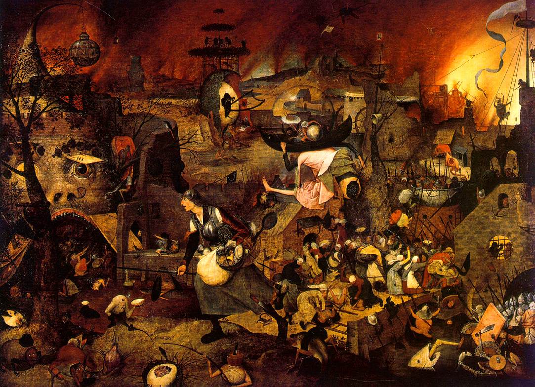
1. data and texture
In Beautiful Evidence, in the chapter on "sparklines", he evokes the intensity of linework in older western artists, using a sample from a Dürer engraving. He evokes it, but I think he mis-describes it. In Tufte's vision, all marks are information—all ink is data. Tufte evokes the Renaissance artist and then moves on to Swiss mountain cartgoraphy, with its similarly intense linework, implying that the Swiss are in the same business.

It's revealing that Tufte chose Dürer to evoke instead of, for example, Rembrandt. Dürer, to our eyes, is fussy; the intensely engraved lines at once read as texture and as information: every mark has a feeling of intent, and the sum is a rich picture, full of recognizeable detail but still forming a coherent statement as a whole.

Rembrandt's etchings are no less detailed, and form no less of a statement, but each mark does not imply data in the same way Dürer can seem to. Rembrandt's marks, especially as he matured, are about texture. In the map world, we know that's a lot of what pulls a map together: texture. We want it to be meaningful, for that texture to itself carry meaning, but we need to remember that the holding-together of the map is what it's really there for, and that at a certain level it no longer carries specific data-meaning: at one scale the wobbles of a river-line are traced precisely, but at a certain point they only mean "the river isn't straight." They are texture, not data.

2. ridicule
I was struck at how Tufte uses ridicule as a weapon against the "enemy": Clarity is good, confusion is bad. If you're going to intentionally create a muddle, make it a clear muddle. And he picks good targets: the ineffective decision-making that led to the Challenger explosion, Powerpoint's limitations...

Here's the problem:

If we become afraid of ridicule, we will not push ourselves. Sometimes, like when launching a hugely expensive piece of equipment into outer space with seven humans aboard, careful is a really really good idea. But not all charts and statistics should carry this sort of load. That no-fun attitude is, maybe, why cartography ends up feeling so stilted sometimes.

I'm a believer in Sturgeon's Law, “Ninety percent of everything is crap.” Theodore Sturgeon was a science fiction writer. From Wikipedia:
The meaning of Sturgeon’s Law was explicitly detailed by Sturgeon himself. He made his original remarks in direct response to attacks against science fiction that used “the worst examples of the field for ammunition”. Using the same standards that categorize 90% of science fiction as trash, crud, or crap, it can be argued that 90% of film, literature, consumer goods, etc. are crap. In other words, the claim (or fact) that 90% of science fiction is crud is ultimately uninformative, because science fiction conforms to the same trends of quality as all other artforms do.
From my point of view, Tufte in using ridicule to fight against what he calls "chartjunk" is also throwing out the baby with the bathwater.

What baby? What bathwater?

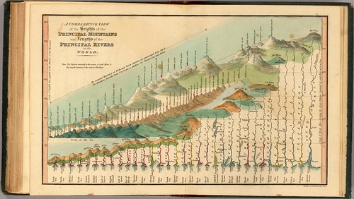
3. In defense of texture and the Baroque
Tufte points to a graphic like this first in Envisioning Information as an example of an interesting use of simplification and distortion to allow comparison. Later, in Beautiful Evidence, he ridicules it for having all that extra texture, the knobby lakes and so forth. To me, this is a really beautiful and interesting graphic, something to strive for, not an eccentric maiden aunt. That texture and those extra squiggles don't communicate Really Useful Data, but they do present part of a sense of identity and character.

Tufte attacks information graphics with unnecessary framing, or with editorial illustration, and he uses egregious examples to do it with. But like Sturgeon says, there's lots of crap to go around. I want to look at some baroque graphics that work. Like the river-comparison chart, or historic illustrated maps. Tufte repeatedly quotes Jonathan Swift: "So, geographers in Afric maps,/With savage pictures fill their gaps/And o'er unhabitable downs/Place elephants for want of towns.").

You know, I like the elephants. I like illustrated maps when they are done well. There are lots of badly done "plain" maps, and Tufte is at his best when he's giving us a theoretical framework to work within in building that sort of graphic, but I think he falls down when he turns around and says that that sort of graphic is superior to baroque graphics.

Over and out for now.

Wednesday, February 25, 2009

Diana Wynne Jones and rules and structure

While I was sick earlier this month, I reread (after entirely too long) Diana Wynne Jones' Fire and Hemlock. It's one of my favorite books; for a while in my early 20's I would have put it atop my list of favorites. As Jones explained later in an essay on the novel, it's at root about the heroic ideal—she has a really great piece of the essay where she summarizes the rise and fall of that ideal—and how it translates into modern ways of thinking. I'll write more fully on it later, and about the truly problematic ending of the book (it's the one thing pretty much everyone ends up compaining about in the book). But what it brought to mind in rereading Tufte, is the difference between structure and rules.

Jones hates rules. No, that's too strong, but a lot of her characters spend their books working their way out of a web of rules, only to discover that those been used by the villains to hide the true state of things from everyone. They've been used to cheat.

On the other hand, discovering the true state of things, which often involves learning about the structure of the story's universe, is often central to the action of her stories. She loves structure, as her nonfiction essays make clear. Fire and Hemlock was built around the structure of T.S. Eliot's Four Quartets, which she admires for their mix of stasis and change. If anything, her fascination with the shape of stories may be a weakness; she get so caught up with the structure sometimes it's hard for her to just follow the story where it needs to go according to emotional logic. Sometimes. Especially at the end of stories.

In her short story "The Sage of Theare," the two ideas are tied together in my mind by this pronouncement, presented as a graffito:
IF RULES MAKE A FRAMEWORK FOR THE MIND TO CLIMB ABOUT IN, WHY SHOULD THE MIND NOT CLIMB RIGHT OUT, SAYS THE SAGE OF DISSOLUTION
I love that. To me it puts structure and rules in precisely the right place: necessary but not exclusive.

Jones's stories though, differentiate between the True Structure of the universe (the way things work we can't do anything about), and rule structures set up to imitate that True Structure and replace it in people's minds. These structures are all about the maintenance of power.

I had a long conversation with Joe tonight, after entirely too long. In regards to rules, he talked about how strange it has been for him to be back in an office environment after a long time away. In particular, he has been reminded of a peculiar dynamic of work environments: everyone is working from their own rulebook. Some are there to earn their paycheck and then go do what they really love, and they pay by rules that follow this way of thinking about work; some are there to do Great Work regardless of what the needs of the company are, and they have a different set of rules; some are there because they are workaholics and they go crazy if they aren't there—another set of rules. And so on. And each person quickly learns who is playing with a comparable rulebook, and who is just weird (i.e. everyone else). In an office environment where people are allowed to play by their own rulebook and where their role in the company fits that rulebook, it can work out fine. Where everyone is expected to play by the same rulebook, those who don't end up in a Dilbertian nightmare sort of job.

It got me thinking about our "what is a map" discussions, here and elsewhere. I think the same thing applies: we want our rulebook to be the rulebook. I'm not saying we don't need rulebooks. It can be really useful to discover what your rulebook is; it can help immensely in clarifying your work. What is more useful to the wider community though is to describe (measure?) the structure we are working in—in my case, the structure of cartographic expression—and then work with that structure with our own rulebooks, without using formulated rules to proscribe that structure.

If we can stand it.

I hope that all made sense.

More soon on E Tufte.

Saturday, February 14, 2009

Revisiting Tufte, Pt 1: Visual Display of Quantitative Information

[note: I have this to say about pneumonia: Bleh! I'm feeling much better, but let me just say that as weight-loss programs go, I do not recommend this one]

In response to Katie Benjamin's question, I decided to go back and read Edward Tufte. I read him years ago, but it's been years.

I've started with the first of his "big books," The Visual Display of Quantitative Information.

A few thoughts:

The book starts out so well. Really good observations and history of statistical graphics. And then the basic concept of graphical integrity, one in a lineage of "graphic parades of horribles," in a line with How to Lie With Statistics and How to Lie With Maps. It's an effective and entertaining technique, and Tufte does a good job with it, in particular excoriating those who make infographics that in their pictoriality distort the data.

In particular, the idea of the ink-to-data ratio is a useful one: if a mark doesn't mean something, leave it out. It's really a Strunk-and-White kind of practical model towards lean and effective graphics.

After that, I fear things go downhill. First, his analysis of why we have bad statistical graphics. He ascribes this to (1) bad training on the part of graphic folk who haven't spent much time with data analysis: they are drawing about things they know little about; (2) the idea that statistics are boring and need "livening up" if readers are going to pay attention; and (3) the idea that readers won't understand charts if they're too plain.

Basically we have charts that lie because the people who make graphs are ignorant, disrespectful and bored. If you make bad graphics, it's a character fault. I think it's a cheap shot.

He then goes down the road towards graphic language reform in the name of "data-ink" maximization, proposing specific new techniques that feel to me a little like the spelling reforms of Melvil (aka Melville) Dewey: based on sound theory, but ignoring the power and centrality of cultural habit. They assume because something makes sense and fits an ideal of simplicity that people will either do that something or be dunderheads.

Maybe people like complexity for its own sake. Sometimes at least. Coming soon, a blog entry: in defense of the graphically baroque.

The following chapter I think illuminates what's really going on: It's called "Multifunctioning Graphic Elements" and it's about graphics that can be read fully from a variety of different view points. The graphics in this chapter are like poems: they are multi-faceted, complex, sometimes ambiguous in the sense that they play different sorts of information off each other in the same expression.

They really are things of beauty.

So here's what I think: sometimes you want a poem, but sometimes you you want a straight answer to the question, "how much does that tomato cost?"

The former, you want to pack in multiple layers of meaning in a way that may miraculously land in your lap or that may take years of gathering and pondering. The latter, you want a clear social mind operating in the moment, which can respond in the same language to a conversational question.

The presumtion that all communications ought to strive for a single ideal oversimplifies the variety of human communication. I think Tufte actually has interesting reads on multiple pulses; I'm just not convinced that in his quest for Overarching Rules he hasn't Overreached.

In any case, more from the Tufte trail soon...

Monday, January 26, 2009

Bad Reviews

Something I've been doing more recently is seeking out negative reviews of stuff I love. Positive reviews all sound alike ("such a wonderful piece of work, it moved me deeply in ways I am only beginning to explain"), but negative reviews can help you suss out what's really going in the experience of viewing a movie or reading a book.

I loved The Curious Case of Benjamin Button. The last few minutes left me bawling, sobbing uncontrollably. So I was really interested to hear from a friend that a friends of hers had hated it, had felt she was being manipulated, and that finding out it was the same director as Forrest Gump suddenly made it all make sense.

The point I take away is that any work of fiction has that manipulative quality to it: the author sets you up, the author puts the puck neatly between your legs. The question is, can you see the system of pulleys by which the puck actually travels into the net? And in the end, it's the willingness to be taken in we bring to the experience. What visible strings are we willing to ignore, and which ones just leave us stranded outside the movie, looking at how it was constructed.

Ingrid and I are working our way through Mary Rose O'Reilley's books. We've both finished The Barn at the End of the World, and loved it, and now she's mostly through The Love of Impermanent Things, and likes it too. I'm waiting my turn.

I doubt I would have read it without knowing Mary Rose from Meeting, without our friend Kit saying she was one of her favorite writers. And I fell for the book, fell into it, fell over it. So I went hunting for the negative reviews.

They were remarkably like the negative reviews for War is the Force That Gives Us Meaning: not enough structure, non-rigorous use of quoted literary material, and a general lack of direction. Which is absolutely right in both cases. Hedges and Mary Rose do not build rigorous arguments. In Hedges' case, his argument just builds in momentum until it's kind of overwhelming. For Mary Rose, there isn't an argument really, except perhaps an argument for sprituality as experiential, and the argument proceed not by any unifying rhetorical device but by the accumulation of 99 little chapters. Many of them feel like spoken ministry in Friends Meeting.

Something I value in what I read is a writer's approaching things from an experiential rather than a formal point of view, which is so totally opposite of what I do in my cartographic life. I enjoy the experience of formalizing and structuring the information (or more properly, coming to understand the underlying formal structure of the data), and of making that structure clearly visible and understood. But what I love to consume as a user of information is this purely experiential plunge-over-your-head-and-paddle-around stuff.

Interesting.

Monday, January 19, 2009

War

It's been a little overwhelming, frankly, the amount of new stuff I've absorbed this last few weeks. Thanks to all the regulars, new and old, who have really opened some new ideas and ways of seeing/listening to me here. I'm kind of playing catch-up...

I recently read Chris Hedges War Is a Force That Gives Us Meaning, which came out in 2002. It's premise is that war is Hell (nothing new there) and yet deeply seductive, even to those who have lived it. It is not an especially structured book, but that's OK. It swept over me.

One thing I was reminded of in reading Hedges' book was the character Destruction in Neil Gaiman's Sandman. The premise of that series of graphic novels was a bickering family of "Endless," embodiments of forces which are within us and yet out of our control (cutely all have names beginning with D: Death, Destiny, Dream, Desire, Despair, Delerium (who used to be Delight), and Destruction). Destruction is the embodiment especially of war. But the character abandoned his work sometime in the early seventeenth century, as war came to be seen as a "science," instead of as a horseman of the apocalypse or Dulle Griet (in my mind's eye I conflate Dulle Griet with another Breughel painting, The Triumph of Death). It was no longer a force beyond human control.

Or so people wish to believe.

Hedges book to me effectively bridges that gap between war (and us-and-them conflict in general) as a force we are somehow unable to control, and the sort of scientific brutality that cartography (see, I knew we'd get back to cartography some time) has at times been party to. In particular, he looks at war's addictive qualities, and the ways in which frankly violent criminals are able to harness the seductive qualities of war for their own ultimately disastrous purposes.

As you can tell, I recommend it.