They're also a treasure trove of examples of information graphics and how to make them clearer.
I've been realizing as I revisit Tufte that his foundational structure is pretty well laid out in The Visual Display of Quantitative Information, the first of his "picture books". The other three books are essentially collections of add-on essays. There may be themes running through the books, but really each chapter stands alone quite well, referring to the original book and to other essays from all four volumes.
I was struck by a few other things:
1. data and texture
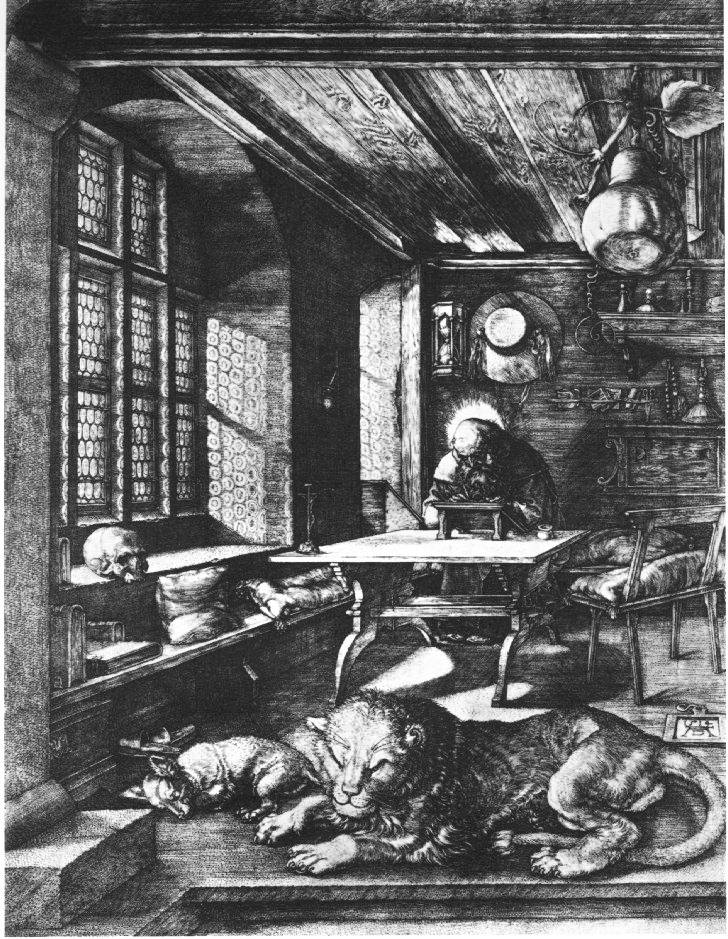
In Beautiful Evidence, in the chapter on "sparklines", he evokes the intensity of linework in older western artists, using a sample from a Dürer engraving. He evokes it, but I think he mis-describes it. In Tufte's vision, all marks are information—all ink is data. Tufte evokes the Renaissance artist and then moves on to Swiss mountain cartgoraphy, with its similarly intense linework, implying that the Swiss are in the same business.
It's revealing that Tufte chose Dürer to evoke instead of, for example, Rembrandt. Dürer, to our eyes, is fussy; the intensely engraved lines at once read as texture and as information: every mark has a feeling of intent, and the sum is a rich picture, full of recognizeable detail but still forming a coherent statement as a whole.
Rembrandt's etchings are no less detailed, and form no less of a statement, but each mark does not imply data in the same way Dürer can seem to. Rembrandt's marks, especially as he matured, are about texture. In the map world, we know that's a lot of what pulls a map together: texture. We want it to be meaningful, for that texture to itself carry meaning, but we need to remember that the holding-together of the map is what it's really there for, and that at a certain level it no longer carries specific data-meaning: at one scale the wobbles of a river-line are traced precisely, but at a certain point they only mean "the river isn't straight." They are texture, not data.
2. ridicule
I was struck at how Tufte uses ridicule as a weapon against the "enemy": Clarity is good, confusion is bad. If you're going to intentionally create a muddle, make it a clear muddle. And he picks good targets: the ineffective decision-making that led to the Challenger explosion, Powerpoint's limitations...
Here's the problem:
If we become afraid of ridicule, we will not push ourselves. Sometimes, like when launching a hugely expensive piece of equipment into outer space with seven humans aboard, careful is a really really good idea. But not all charts and statistics should carry this sort of load. That no-fun attitude is, maybe, why cartography ends up feeling so stilted sometimes.
I'm a believer in Sturgeon's Law, “Ninety percent of everything is crap.” Theodore Sturgeon was a science fiction writer. From Wikipedia:
The meaning of Sturgeon’s Law was explicitly detailed by Sturgeon himself. He made his original remarks in direct response to attacks against science fiction that used “the worst examples of the field for ammunition”. Using the same standards that categorize 90% of science fiction as trash, crud, or crap, it can be argued that 90% of film, literature, consumer goods, etc. are crap. In other words, the claim (or fact) that 90% of science fiction is crud is ultimately uninformative, because science fiction conforms to the same trends of quality as all other artforms do.From my point of view, Tufte in using ridicule to fight against what he calls "chartjunk" is also throwing out the baby with the bathwater.
What baby? What bathwater?
3. In defense of texture and the Baroque
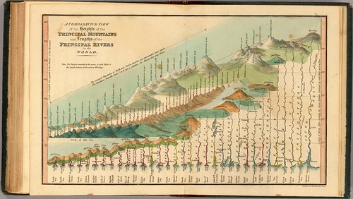
Tufte points to a graphic like this first in Envisioning Information as an example of an interesting use of simplification and distortion to allow comparison. Later, in Beautiful Evidence, he ridicules it for having all that extra texture, the knobby lakes and so forth. To me, this is a really beautiful and interesting graphic, something to strive for, not an eccentric maiden aunt. That texture and those extra squiggles don't communicate Really Useful Data, but they do present part of a sense of identity and character.
Tufte attacks information graphics with unnecessary framing, or with editorial illustration, and he uses egregious examples to do it with. But like Sturgeon says, there's lots of crap to go around. I want to look at some baroque graphics that work. Like the river-comparison chart, or historic illustrated maps. Tufte repeatedly quotes Jonathan Swift: "So, geographers in Afric maps,/With savage pictures fill their gaps/And o'er unhabitable downs/Place elephants for want of towns.").
You know, I like the elephants. I like illustrated maps when they are done well. There are lots of badly done "plain" maps, and Tufte is at his best when he's giving us a theoretical framework to work within in building that sort of graphic, but I think he falls down when he turns around and says that that sort of graphic is superior to baroque graphics.
Over and out for now.
2 comments:
I've only read the first Tufte book but it seems like he assumes that these graphics are solely for conveying information leaving little room for art and beauty and the things that make life (and maps and charts) interesting. His ideas are intriguing and practical (but also rigid) if you only mean to convey information. I think his books are a very useful guideline for cartographers as long as we treat them as (one among many) guidelines and not as rules. I like elephants on my maps too!
I love Tufte, and applaud what he's begun -- which is an investigation into what we're really trying to do with graphical language (apoligies to any real linguists out there). Of course, he is unsufferable, dogmatic, etc..., like many brilliant folks I know.
The best part of Tufte are what his "rules" point towards -- the importance of the relationship of the graphical elements to one another, to the subject they are attempting to say something about.
Graphs work because we can "read" the relationship of one point or line to another, and understand intuitively what that relationship is, especially related to a bunch of other lines or dots on the page. If the way the lines or marks are drawn also bears a relationship to the subject we're trying to reference with those marks, the whole works better, and may uncover more relationships than we had originally anticipated.
But keep in mind that Tufte is not really trying to talk about _evocative_ marks on the page. He's talking specifically about graphic means of rendering the relationships _in very complex data_ clearly.
In architecture, for instance, there are millions of different components to a building, each in a particular relationship to other components -- finishes, substrates, structure, hardware, materials, even voids. These have to be thought of, imagined, perfected, and then described largely by graphical means.
One can do this by adding a lot of notes to the drawings, and by cross-referencing them to one another, sort of like blow-ups of the center of a town on a larger-scale state map. You can also tag pieces of equipment or materials with a number or letter, for which there is a legend or schedule someplace else. All architectural drawings make these references, and the legends or schedules can become useful in and of themselves, in giving a concsie list of, say, all the paint colors required for a particular project.
But the way the drawings really become effective, and avoid the dreaded and costly RFI (Request For Interpretation) when the damn thing is built, is to make as many corelations between drawings as possible. A section (essentially a drawing made as if one had taken a buzz-saw to the whole project, and exposed the innards of all the walls and ceiling) is most effective when paired with a plan of the same area.
When you begin to retain the construction lines of the original drawing (the way one draws a sectoin is, after all, by drawing a series of parallel lines from the plan to your setional drawing), the original important relationships between the two drawings are obvious, and become the scaffolding which connects the two.
I guess I'm saying all this because these are drawings that have to work correctly -- that is, much like a map, it has to tell the truth in order to accomplish its goal.
But there is a different kind of graphical integrity, too -- whereby we can tell, by the way we feel looking at it, or making the marks, whether it's the right mark, or whether we have to try again. These are the sketches of a plan (perhaps even traced over the fussy and correct CAD-drafted plans beneath) which tell us about an awkwardness we have yet to ressolve, a hesitation in the pen as the hand moves that tels us something about a disruption in the composition of the whole.
And also those sketches which can get at something that all the complex grahpics in the world can't touch, like Zaha Hadid's oil paintings long before she begins drafting a project.
Post a Comment